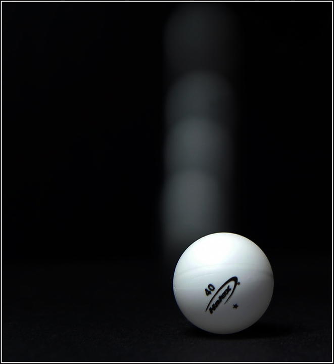
Gnop-Gnip sounds about right. I keep thinking that the logo should be sharper, but I can't give a reason why. The cyan tint on the ball seems out of place.
I'm trying to figure out how you set this up. Presumably held the ball at rest for a short time and then "released" it, or pushed it. But why are there three distinct areas rather than one long blur. Hmmm. Fun...





 Add photograph to your favorites
 Add photographer to your favorites


 Photographer found comment helpful.


