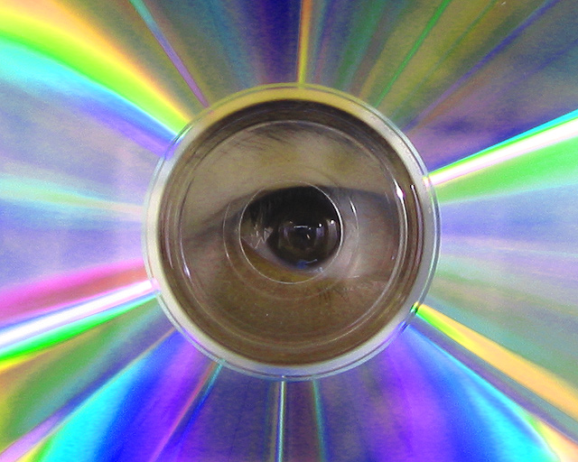
Super idea - very original. Somehow you needed o figure a way to get some light on the eye. The colors of the CD are so vibrant, and the eye so "dim" - it loses impact.
One of remarkable few images so far to display an understanding of the requirements graphically of a centred composition. There is a problem for me in the overall sense of lack of clarity - the eye itself is so comparatively dark that it is difficult to fix my eye on any detail there. I think perhaps some dodging/burning work might have helped the balance of brightness in the shot. 5
I like the idea, but it's a bit too obvious that you used a CD for this..the colours are realy splashing, but the eye is too dark to be in the center of attention, unfortunately the heavy colours snatch all of it away from the center.. Further more, there is grain in your picture that isn't in it's place here...







 Add photograph to your favorites
 Add photographer to your favorites


 Photographer found comment helpful.


