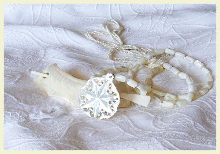
I missed the deadline for light on white, so here is what was going to go in.
Sharpen, brightness contrast, duplicate layer, more brightness/contrast, eraser 50% on star and hair clasp, border, esize, cloned out a metal catch since it is not going in challenge.
That star is so pretty! You ought to do a macro of it for the base of an expert edit or to use as an overlay! The fabric reminds me of a bedspread my grandmother used to have. So cute!
Very nice concept, love all the mother of pearl it positively glows! The pattern in the spread works so well with the shapes of the jewelery. I wouldn't mind seeing some of the cyan/blue removed from the bedspread so it is more creamy like the jewelery.
I love the fabric you've used as a background here - lovely pattern on it that shows up well here. The display of the items seems a bit haphazard to me, though I'm not the right one to tell you how to set it up better (I truly suck at trying to do stuff like this.) Light is good - nice and gentle and enough of an angle to create pleasing depth on the cloth.





 Add photograph to your favorites
 Add photographer to your favorites

 Photographer found comment helpful.


