| Author | Thread |
|
|
02/15/2009 11:44:49 AM |
|
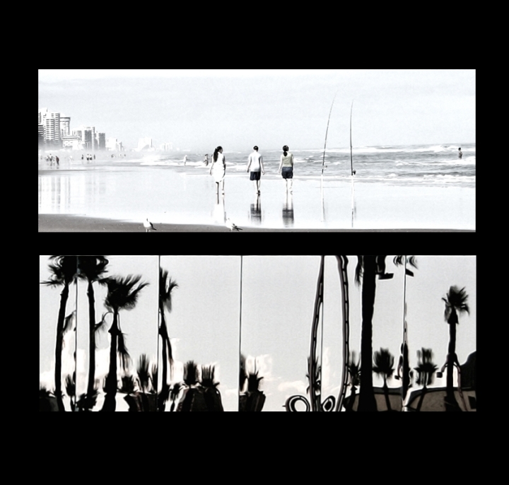
Both panels are great. Like the high key look of the top one and the near-abstract look of the bottom. |
|
 Photographer found comment helpful. Photographer found comment helpful. |
|
|
02/04/2009 04:29:57 PM |
|
I'm wondering how you got that washed out tone on the top image. I like it. |
|
| Photographer found comment helpful. |
|
|
02/04/2009 04:10:15 PM |
|
Wonderful pairing - the verticals bring it together as well as the faded colors/tones. This works very well! |
|
| Photographer found comment helpful. |
|
|
02/02/2009 11:33:56 PM |
|
Lots of life to this one, and you kind have the fun-house thing going on again on the bottom. Very nice! |
|
| Photographer found comment helpful. |
|
|
02/02/2009 11:27:14 AM |
|
I like the almost high-key approach with the top one works well for this beach landscape. The palms in the bottom almost look like ghost, nice abstract work. |
|
| Photographer found comment helpful. |
|
|
02/02/2009 10:51:09 AM |
|
| Photographer found comment helpful. |
|
|
02/02/2009 05:32:31 AM |
|
| Photographer found comment helpful. |
Home -
Challenges -
Community -
League -
Photos -
Cameras -
Lenses -
Learn -
Help -
Terms of Use -
Privacy -
Top ^
DPChallenge, and website content and design, Copyright © 2001-2026 Challenging Technologies, LLC.
All digital photo copyrights belong to the photographers and may not be used without permission.
Current Server Time: 07/05/2026 01:10:28 PM EDT.