| Author | Thread |
Comments Made During the Challenge  |
|
|
02/09/2009 11:26:30 PM |
|
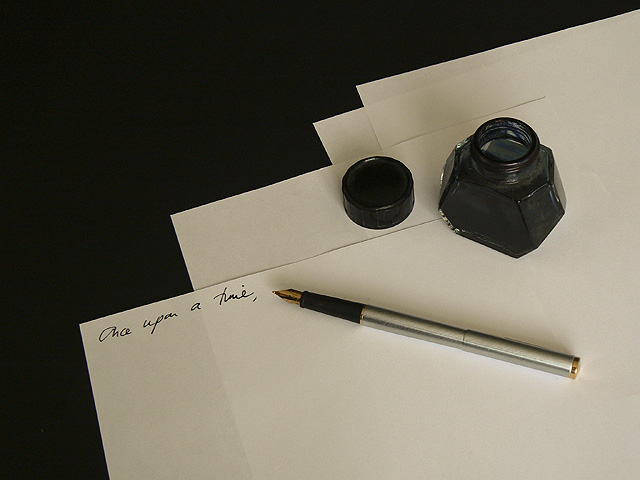
Waterman ink, but the pen does not look like a Waterman - maybe a Scheaffer? |
|
|
|
02/06/2009 02:31:38 AM |
|
nice concept, lighting could use a touch of work, and maybe expose a bit longer |
|
 Photographer found comment helpful. Photographer found comment helpful. |
|
|
02/05/2009 01:07:57 PM |
|
I wish the white of the paper was a bit brighter - apart from that, I love it. |
|
| Photographer found comment helpful. |
|
|
02/04/2009 12:53:57 PM |
|
Nice idea, and I like the way the pen reflects off the paper. The left half of this shot is just too flat for me, and the ink too solid. More lighting from the upper left would have created a bit more depth. |
|
| Photographer found comment helpful. |
|
|
02/04/2009 12:22:12 PM |
|
Fits the challenge topic but is kind of a boring photo. 4 |
|
|
|
02/04/2009 09:53:39 AM |
|
Very nice composition and concept. The paper could be whiter or maybe the lighting could be a tad brighter. |
|
| Photographer found comment helpful. |
Home -
Challenges -
Community -
League -
Photos -
Cameras -
Lenses -
Learn -
Help -
Terms of Use -
Privacy -
Top ^
DPChallenge, and website content and design, Copyright © 2001-2026 Challenging Technologies, LLC.
All digital photo copyrights belong to the photographers and may not be used without permission.
Current Server Time: 06/28/2026 09:35:32 PM EDT.