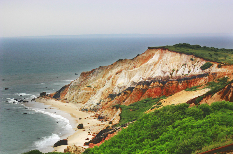
I think the saturation is fine, although the lower right tends to draw the eye a bit. If you boosted the blue in the water (as suggested by others) it would balance things out a bit. This must have been amazing to see in real life, your photo makes me want to go there and shoot and shoot and shoot.
Yeah, a little over the top in that the muted water tones don't match the light and brights in the rocks and foliage. I'd crop some of that sky out to bring the attention more down to your cliffs.
You've done a fabulous job of removing the haze present in the original. I really love the intensity of the colors and the defined texture in rocks, you definitely met your stated goal!




 Add photograph to your favorites
 Add photographer to your favorites


 Photographer found comment helpful.


