| Author | Thread |
|
|
02/13/2009 01:16:39 PM |
|
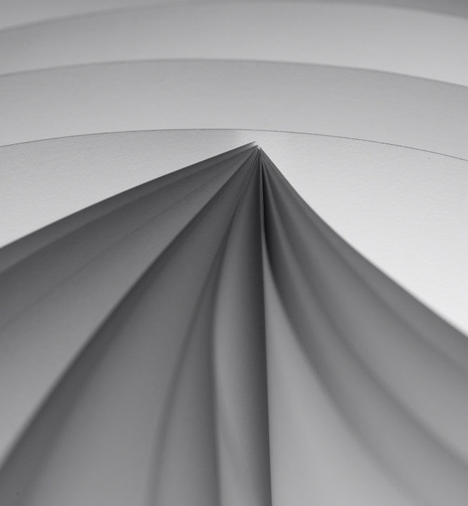
as per usual, this place never rewards abstracts. super job on this. |
|
Comments Made During the Challenge  |
|
|
02/07/2009 06:28:11 PM |
|
I like the idea and the tones, really wish there was more DOF up front in the image |
|
|
|
02/06/2009 03:56:53 AM |
|
INTERESTING! Unique. Could be improved by more dramatic lighting and still stayed 'grey'. |
|
|
|
02/05/2009 11:25:06 AM |
|
Wonderful tones. Meets the challenge well! 9 |
|
|
|
02/03/2009 10:15:29 AM |
|
A very strong geometric composition that works well in this photograph, in my opinion. |
|
|
|
02/02/2009 10:26:10 AM |
|
I'm not sure I like the dof used here. Seems like the photo could be improved if you could clearly see the pages from foreground to background. |
|
Home -
Challenges -
Community -
League -
Photos -
Cameras -
Lenses -
Learn -
Help -
Terms of Use -
Privacy -
Top ^
DPChallenge, and website content and design, Copyright © 2001-2026 Challenging Technologies, LLC.
All digital photo copyrights belong to the photographers and may not be used without permission.
Current Server Time: 06/29/2026 11:49:51 PM EDT.