| Photograph Information |
Photographer's Comments |
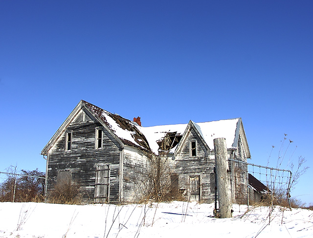
Challenge: Silence II (Basic Editing)
Camera: Nikon D40
Lens: Nikon AF-S DX NIKKOR 18-200mm f/3.5-5.6G ED VR II
Location: crest of hill near Lockhead/3rd Line, NG
Date: Jan 24, 2009
Aperture: f7.1
ISO: 200
Shutter: 1/500
Galleries: Landscape, Architecture
Date Uploaded: Jan 26, 2009
|
An abandoned old farmhouse by the side of the road, roof falling in and all. I wanted to capture it now, while it's still there, cause I am afraid that with the rapacious land needs of the City of Ottawa, yet another piece of farmland will soon be lost to suburbia.
pp: RAW conversion, curves, brightness/contrast, saturation, crop, resize, usm, sharpen edges, save for web |
| Author | Thread |
|
|
02/08/2009 02:28:24 PM |
|
The colors are wonderful. With the exception of the sky, this looks a lot like an Andrew Wyeth watercolor. (His sky would have been gray or white I imagine.) I really like the hint of color in the dried vegetation. The blue sky is beautiful, but I'm wondering if it overpowers the rest of the image. |
|
 Photographer found comment helpful. Photographer found comment helpful. |
Comments Made During the Challenge  |
|
|
02/02/2009 08:40:50 PM |
|
I feel like there's too much negative space above the house. |
|
| Photographer found comment helpful. |
|
|
02/01/2009 10:29:39 AM |
|
Nice angle and composition is good. Maybe lacks a bit of detail in the snow. Does convey some feeling of silence. 5 |
|
| Photographer found comment helpful. |
|
|
01/31/2009 12:12:08 PM |
Lighting is a little flat on the building, not a lot to really catch my eye. Maybe shooting at a different time with less direct sunlight it would have worked a bit better? Fence post to the right is distracting in this composition as well. The house, being placed where it is (right in the center) is not giving me a lot of visual interest. Maybe composing the shot so that the house starts at the left (instead of the chain link fence which is just visual clutter) would have brought more attention where you wanted it. At the moment, I'm not really sure where that is.
I hope I'm not being rude! I try to give constructive criticism where I can, because that's what I like to get on my images.
_Nathanael |
|
| Photographer found comment helpful. |
|
|
01/30/2009 07:25:04 PM |
|
I like this photo, and the house makes for a very good motive, but the blue sky is a bit to... blue... I would've come back on a cloudy day, or in the evening/night, to take a new one. Would've added more drama. My oppinion. Everything else is beautifull. |
|
| Photographer found comment helpful. |
|
|
01/29/2009 08:27:39 PM |
|
I think a little tighter crop on this would have been nice- maybe take out some of the fence and dead space on the left and right. But great color/saturation in the sky- brings a nice contrast to the house. |
|
| Photographer found comment helpful. |
Home -
Challenges -
Community -
League -
Photos -
Cameras -
Lenses -
Learn -
Help -
Terms of Use -
Privacy -
Top ^
DPChallenge, and website content and design, Copyright © 2001-2026 Challenging Technologies, LLC.
All digital photo copyrights belong to the photographers and may not be used without permission.
Current Server Time: 06/29/2026 08:00:51 AM EDT.