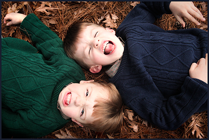
These kids belong to one of my best friends. They were a lot of fun to work with.
I really hope this does well, I feel really good about it :) Maybe a top 10 :) We'll see! This is my 2nd submission w/ my new canon 5dmII so I'm pretty excited.
Editing, just remoted a piece of pinestraw from the kid on the right's shirt. other than that, I went in and did some curves adjustment layers, dodge and burned their eyes to add a little sharpness/detail, and resized with smart sharpen on top of that.
my guess on this is probably a little optimistic, but i'm hoping to get another 7+ out of it, but would be happy w/ 6.5+
-------
i was way off on this. i don't know why it did not score very well at all
oh well, thanks for the WONDERFUL comments!
Statistics
Place: 70 out of 112 Avg (all users): 5.4423 Avg (commenters): 6.6667 Avg (participants): 5.0435 Avg (non-participants): 5.6091 Views since voting: 1453 Views during voting: 276 Votes: 156 Comments: 12 Favorites: 0
For me the biggest thing that kept the score low was the exposure on the faces, they just seems a tad harsh to look at it. Also, they seem a bit posed and not natural. Posing subjects isn't bad, but if they are just "Monkey'ing Around" they probably wouldn't be in this position.
Take a look at these and compare side by side to see how the lighting affect the faces.
I gave a 6. But side on does not give me an immediately recognizable face full of personality. I bet there are other good ways of posing these two mischievous boys to exhibit personality to great effect. The faces seem slightly over exposed for my liking and my monitor is not bad as regards calibration.
Its a real cute shot and the technicals are very nice but I'm afraid we've all just sorta seen this shot done before, and in general i don't think the DPC crowd likes portraits of what looks to be the photographer's children or their pets, unless they are exceptionally creative. The faces might be a tad over exposed but there really is nothing to complain about this shot, but also not much for sustained interest.
I like the idea you have gone with, attempting to show the different personalities of the kids. The bockground of natuiral brown matter works really well here, the blue and green contrasting jumpers with the same design, the same shirts, all link the two boys together as brothers without the photo being boring colourwise due to the same cloths.
However.........
The faces appear overexposed, especially the left hand side of the boy in the upper part of the shot. The detail in his face has been lost, and with it, some of the expression. If both of these were correctly exposed, more of the expression would have been obvious, and therefore more of their personality on show.
I would prefer to be able to see the eyes. The lower boy is good, the upper boy I cannot see them. Maybe just a preference, but the eyes tell much of the story........
The faces are off centre. Always an interesting argument around here. To me it makes the photo left dominated. I wouold have cropped with the two faces closer to the middle. This would also have removed the partically cropped out hand. The upper boys left hand is also awkward. The lower boys hand is good. The upper boy could have had both hands on his chest, or that left hand on the ground instead, but not in the air.
Even the expression on the upper boy is not greta. The lower boys expression (if not overexposed), appears to be great and spot on.
Well, my two cents. Hope it helps. And questions, PM me......






 Add photograph to your favorites
 Add photographer to your favorites


 Photographer found comment helpful.


