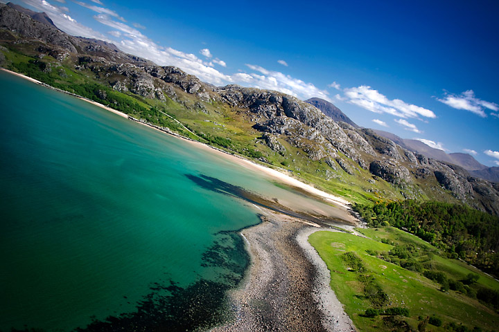
HOly Crap is that horizon tilted and not in a good way. you do have crisp clean leading lines downwards and good colour and detail, but you are going to get slaughtered for the tilt
Engaging landscape but I personally don't care for tilted landscape, not to say they don't have artistic merit just makes me feel off kilter looking at it.
a very interesting take on composition - i can see the reason to fill the frame as much as possible with the non-horizontal horizon - i like the lovely lighting and colors - but that perspective makes me a bit dizzy!
Fine...but I see no real good reason nor artistic asset for the oblique crop - something working well with simple lines, but not with a complex landscape IMO.







 Add photograph to your favorites
 Add photographer to your favorites


 Photographer found comment helpful.


