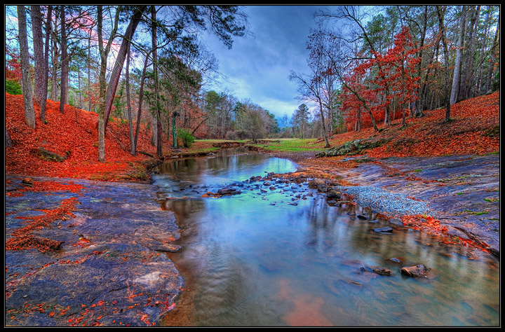
My first impression was that the colours are too much, but as soon as it filled out on my screen I changed my mind: whatever you did with them they bring out the variety and richness of all the features in a way that I suspect the eye could not have done in one glance. A celebration, really.
9 - Oh boy... beautiful. Lovely title too. I don't know if you tweaked those reds in pp (will check back pc), but either way, very nice. Closer inspection, I'd like to see a little more height in the trees (so possibly the frame, but who knows)... but minor - and starting to nit-pick. Really like that you can see 'far away' too.
It doesn't look like a polarizing filter was used...it really helps water shots. I would also like more foreground elements in the image. The color, feel and composition are very good.





 Add photograph to your favorites
 Add photographer to your favorites

 Photographer found comment helpful.


