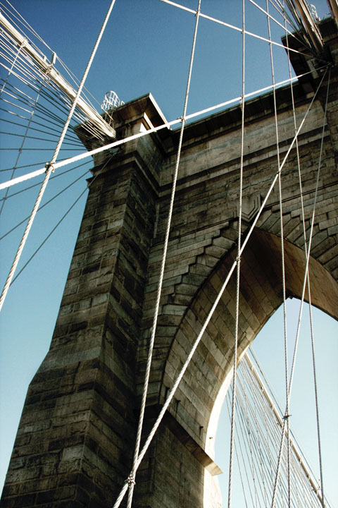
I like the way you've incorporated the lines into your composition. I agree with Hotpasta on the suggestion to use monochrome. It would help bring even more focus on the lines.
This looks like a tough scene to expose for: there's some blown highlights but also some dark areas where we'd like to see more detail. Shooting from the other side of the support might have helped. (I think you could still get the same composition if I remember correctly)
Not appealing to me that much. Either the struts are distracting me from the interesting bridge fascade, or the bridge is distracting me from the interesting struts. Too much going on here.
Nice perspective and lines, not overprocessed (thank you!). Possibly slightly blown highlights on the far side of the bridge (sunlit part of the arch).






 Add photograph to your favorites
 Add photographer to your favorites

 Photographer found comment helpful.


