| Author | Thread |
Comments Made During the Challenge  |
|
|
12/30/2008 01:12:27 AM |
|
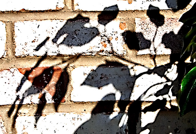
whites are too blown and the image seems heavily over sharpened. i like the pattern of the bricks /4 |
|
|
|
12/29/2008 12:23:09 AM |
|
The bricks appear a bit washed out. Are they supposed to be that white? A good idea otherwise. |
|
 Photographer found comment helpful. Photographer found comment helpful. |
|
|
12/28/2008 11:51:37 PM |
Like how the outline of the shadow matches the look of the rocks.
Perhaps the leaves to the right weren't needed. Without them it looks like a nice painting :) |
|
| Photographer found comment helpful. |
|
|
12/26/2008 07:07:13 PM |
|
Contrast here is way too high and the whites are super bright to the point where they are just annoying. The shot also isn't straight, it slopes off to the left. Sorry to sound so critical but these are things that are within your control in PP and are easily corrected. |
|
| Photographer found comment helpful. |
|
|
12/24/2008 05:20:22 PM |
|
Overprocessed. Interesting that all the shadows have borders. |
|
| Photographer found comment helpful. |
|
|
12/24/2008 01:49:04 PM |
|
I like this shot but it is way to over-processed. |
|
| Photographer found comment helpful. |
Home -
Challenges -
Community -
League -
Photos -
Cameras -
Lenses -
Learn -
Help -
Terms of Use -
Privacy -
Top ^
DPChallenge, and website content and design, Copyright © 2001-2026 Challenging Technologies, LLC.
All digital photo copyrights belong to the photographers and may not be used without permission.
Current Server Time: 07/02/2026 07:39:29 AM EDT.