|
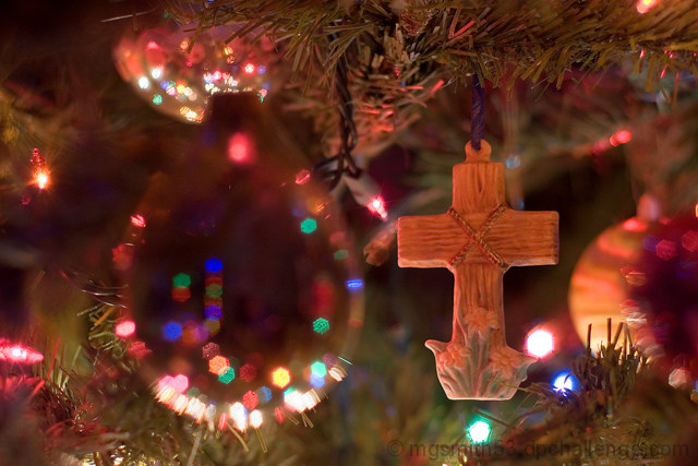
While the area on the left is causing an interesting effect in the bg, I find it a tad unnecessary. It really detracts from the main subject (the cross). The overall image is very highly saturated (a bit too much for my taste) but the colour is nice and warm and gives a homey feeling to the tree and cross. Your placement of the cross is okay but the composition is a little loose... a move to the right slightly would have given more visual pleasure, IMO. Also, and this is just a little personal preference thing, I would like to have seen your cross with a bit more dramatic lighting... maybe with a black card behind it to only light it from the front... Crosses, by nature, create emotion. I think the emotion here would have been better played up by a little creative light :) Good luck! |





 Add photograph to your favorites
 Add photographer to your favorites


 Photographer found comment helpful.
