Greetings from the Critique Club!
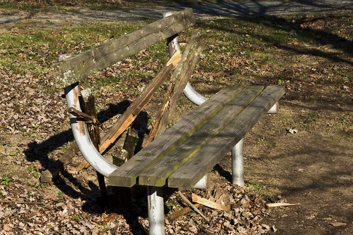
First Impression: A bit different from most entries with the broken back (I like the out of the box thinking), but the bench is a bit hard to see since it blends into the background.
Looking Deeper: The angle here seems pretty straightforward, and you placed the bench right in the center of the frame. There is some bright overhead sun which created some interesting shadows in the frame, but overall it didn't help the shot. It seems like there is some interesting splintered wood on the left, I wish I could see it more.
Suggestions for Improvement: It looks like there may be some interesting potential here with the shadows and the textures of the broken wood. I think with this bench, I may have tried to get in closer to that shattered wood, while still showing enough of the bench to make sure that voters didn't think it was something else. Or perhaps there may have been an angle to show off the dark shadows behind the bench. I also wonder if anything could have been done with a b/w conversion to bring out some textures here.
After reading the comments: Seems like most voters felt the same as I did, and it showed in your score. I do like that a few voters commented on the feeling that the photo evoked in them, and that one voter took the time to notice that it was likely a fresh break in the wood. Just goes to show that even a photo that places 123/125 has plenty to explore, just that many voters don't take the time to notice the details during voting if the shot doesn't have that initial 'wow' factor to them.
Hope this has been helpful. If you have any further questions, please feel free to PM me! |