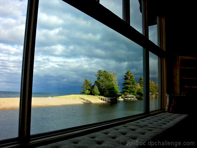
Taken with my Sony P&S because it has a wider angle lens than my Canon.
PP: Shadows/Highlights, USM, despeckled, healed some fly specks on window, exposure, levels, curves, hue/sat. Resized, sharpened, saved for web.
[Oct. 22nd, 2008 10:02:17 PM]
I think the point of this image is being missed. Of course, that's not the fault of the viewer, but the image that is not communicating well.
The affluence I'm featuring here is the house with the window with the incredible view. The window and window seat serve as a frame for the image, but they are also the subject of the image.
This is a double illustration, because the affluent view is of an affluent beach home. Ergo both beach homes are examples of affluence.
The problem seems to be that in their effort to identify the affluence, the viewers are frustrated by not seeing more of the house across the river.
-------------
I am totally annoyed with myself for not noticing that the horizon is off kilter. I was so concentrated on the lines of the window and side of the house, that I didn't notice the horizon. And slanted horizons are one of my big pet peeves. :(
Statistics
Place: 21 out of 115 Avg (all users): 5.8621 Avg (commenters): 6.0000 Avg (participants): 5.8293 Avg (non-participants): 5.8704 Views since voting: 1674 Views during voting: 348 Votes: 203 Comments: 7 Favorites: 0
I remember seeing this shot in the challenge Juli. Congrats on the wonderful score and placement. Beautiful perspective and the lines are magnificent as well as the excellent contrast and color. Really superb and a nice take on the challenge.
Nice idea nad nice view. However, a closer zoom of the building could have been a little better (but then you would loose the framing) The eyes are drawn to the trees and building, but they are too small to really see any detail.







 Add photograph to your favorites
 Add photographer to your favorites

 Photographer found comment helpful.


