| Author | Thread |
Comments Made During the Challenge  |
|
|
10/17/2008 07:06:12 AM |
|
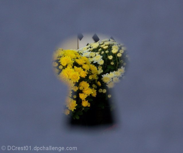
Good idea but too much blank space, and the colour makes it look as though its a piece of paper not a key hole, black would have been better. |
|
 Photographer found comment helpful. Photographer found comment helpful. |
|
|
10/16/2008 08:42:04 PM |
|
| Photographer found comment helpful. |
|
|
10/16/2008 12:01:39 PM |
|
I really like the idea here. Perhaps having the keyhole just a little more defined would help bring the image together, as at the moment it seems a little detatched. |
|
| Photographer found comment helpful. |
|
|
10/15/2008 01:57:49 PM |
|
I like the concept but, it makes the picture more about the blue "keyhole" and doesn't really allow enough "photography" so to speak. The focus around it makes it seem like it was "painted" in during editing, rather than actually photographing the keyhole cut-out. Not sure if I explained that fully enough to understand???? |
|
| Photographer found comment helpful. |
|
|
10/15/2008 01:02:53 AM |
|
Good idea but the view is a bit boring. |
|
| Photographer found comment helpful. |
Home -
Challenges -
Community -
League -
Photos -
Cameras -
Lenses -
Learn -
Help -
Terms of Use -
Privacy -
Top ^
DPChallenge, and website content and design, Copyright © 2001-2026 Challenging Technologies, LLC.
All digital photo copyrights belong to the photographers and may not be used without permission.
Current Server Time: 06/28/2026 09:26:08 PM EDT.