| Photograph Information |
Photographer's Comments |
Challenge: Work (Basic Editing)
Camera: Fujifilm FinePix S1000fd
Location: My bedroom
Date: Oct 5, 2008
Aperture: F/2.8
ISO: 100
Shutter: 1/45 secs
Galleries: Humorous, Portraiture
Date Uploaded: Oct 6, 2008
|
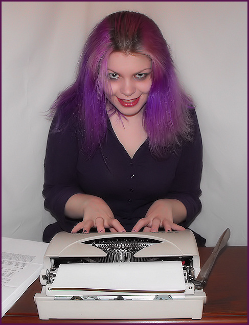
Well now, don't I look sinister!
This is of course a play on The Shining, all work and no play makes Jack a dull boy. This is what happens to my hair when I blow dry it, I didn't even have to mess it up, hehe. I combed back the middle though to hide my roots a bit. I put on what I hoped was a manic expression and here it is!
The light in the room was very bright (2 big windows and a lamp) which glares on the desk and annoyingly washed out the paper a bit. I wish the background were perfectly smooth but I couldnt do that in basic editing. I put dark make-up around my eyes too to enhance the lack-of-sleep-and-crazy look. I'm not crazy about how the editing turned out on this one but after about 25 attempts to get it right, I gave up and settled.
Edit: Cropped and resized, adjusted brightness/contrast using levels, desaturated the red and magenta channels a wee bit, denoised to even out the sheet ripples, sharpened and added the border.
[Oct. 14th, 2008 05:15:51 AM]
During Challenge Comments
I can't believe nobody at all has gotten that this is a spoof of The Shining. The crazy look, the typewriter, the title....I thought it was so obvious. Guess I was wrong!
|
| Author | Thread |
|
|
10/27/2008 07:40:43 PM |
|
i was very surpirsed also that nobody got your shining refference but like another poster said, maybe you have to be into horror movies,,, but as movies go in general this one is pretty wellknown to most eh |
|
 Photographer found comment helpful. Photographer found comment helpful. |
|
|
10/15/2008 12:48:51 AM |
|
If I was a fan of horror movies, I may have gotten the reference, but I've never read or watched it. A really good try though. You put a lot of effort into this one. |
|
| Photographer found comment helpful. |
Comments Made During the Challenge  |
|
|
10/14/2008 12:21:08 PM |
No Vote - Go Team UK!
Good Luck LadyT |
|
| Photographer found comment helpful. |
|
|
10/12/2008 09:51:54 PM |
|
Comment no Vote - Laura this is a fabulous photo and deserves to do well - Fellow DPCO Team member. |
|
| Photographer found comment helpful. |
|
|
10/12/2008 04:19:22 PM |
|
Too "staged" for me...hand positions, nothing on the paper, standard white background. I think it's a good idea and the model's facial expression and hair are great. |
|
| Photographer found comment helpful. |
|
|
10/11/2008 08:20:54 AM |
|
Ahh there is that cute purple haired girl, good luck this weekend. : ). NV |
|
| Photographer found comment helpful. |
|
|
10/11/2008 12:34:59 AM |
|
OMG. that's a typewriter... |
|
| Photographer found comment helpful. |
|
|
10/09/2008 10:49:47 PM |
|
... a dull girl? Don't think so, but it did give you a somewhat sinister grin! The lighting really highlights your skin tone and makeup. Well done. |
|
| Photographer found comment helpful. |
|
|
10/08/2008 10:18:27 PM |
|
I don't think Laura could be dull if she tried! ;) |
|
| Photographer found comment helpful. |
|
|
10/08/2008 09:00:30 PM |
No anonymity for you in this challenge, eh? You have kind of a wicked grin on your face in this pic. Is there something you know that we don't? If I were to nitpick, the way your hands are spread out does not really look like you've been typing. Ok, nitpicking session is over. I'll bet this is the longest comment you get the whole challenge. (I could just say "nice shot") I may come back and add to it later. Ta.
Added: Ok, I had a day to think about it and give you some more useful feedback. As I said before, I love the look on your face in this shot. Not sure what the look is saying though. Maybe it's a touch out of place and seems like more of a "come hither" look than an "I'm tired of working" look. I think what hurts it the most is the slightly uneven lighting. It seems a bit brighter toward the bottom of the frame. The wall or curtain in the back has some wrinkles that grab the eye. Overall, the shot seems a little dull on the color and maybe needs a little more pop added to it somehow. Not including your hair, of course. That's well saturated, as always. Maybe the image is cropped a little too tight at the bottom as well. Hope this was useful to you. Now go out and beat up on my entry. |
|
| Photographer found comment helpful. |
|
|
10/08/2008 05:27:34 PM |
|
dull? you? never! A tad too much NI overall for my liking but love the pose - good luck |
|
| Photographer found comment helpful. |
|
|
10/08/2008 04:59:23 PM |
|
This is a mischievous self portrait,IMHO if you had taken a side on shot using the same expression with your head turned towards the camera this would have improved the composition for this challenge.The quality of the photo is very good....8 |
|
| Photographer found comment helpful. |
|
|
10/08/2008 02:10:02 PM |
|
Nice expression and lighting - Maybe just a tad too staged. Slow synch flash with loads of movement may have helped bring a bit of life to this. |
|
| Photographer found comment helpful. |
Home -
Challenges -
Community -
League -
Photos -
Cameras -
Lenses -
Learn -
Help -
Terms of Use -
Privacy -
Top ^
DPChallenge, and website content and design, Copyright © 2001-2026 Challenging Technologies, LLC.
All digital photo copyrights belong to the photographers and may not be used without permission.
Current Server Time: 06/28/2026 08:59:53 AM EDT.