| Author | Thread |
|
|
10/15/2008 06:05:21 AM |
|
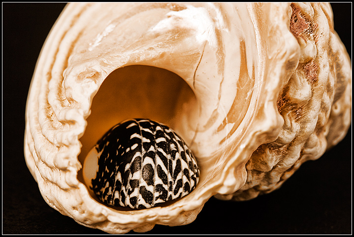
I like the idea here.The cut off end of the larger shell on the right helps to strengthen the feeling that it continues on beyond the frame, although the top of the shell, being cut off, spoils the line that I keep on wanting to see there. I can't help feeling that I'd like to see a strong line leading off into the distance. |
|
 Photographer found comment helpful. Photographer found comment helpful. |
|
|
10/06/2008 07:22:22 PM |
|
Nice composition, like the contrast between the patterns of the two shells. |
|
| Photographer found comment helpful. |
|
|
10/04/2008 05:27:49 AM |
|
I love the 2 completely contrasting shells and the way you have arranged them together. The black background and then the black on the smaller shells works really nicely. Great detail. |
|
| Photographer found comment helpful. |
|
|
10/03/2008 03:09:23 PM |
A very nice subject study here. Good choice on shell selection (contrasting colors/patterns) and a nice arrangement as well.
Lighting works fine as is, although I wonder if you considered anything more dramatic, side-lighting, etc... Also, consider a polarizer to control the light glare (it's not bad - but I wonder what a CP would do for this).
Obviously, JMO. :-) |
|
| Photographer found comment helpful. |
|
|
10/03/2008 02:20:29 PM |
|
Very interesting how the light reflects. I also like the contrast between the two shells. |
|
| Photographer found comment helpful. |
|
|
10/03/2008 12:59:56 PM |
|
I REALLY like this image. I like the subject and the composition. And the focus, light, and contrast are wonderful. Congratulation on a real beauty! |
|
| Photographer found comment helpful. |
Home -
Challenges -
Community -
League -
Photos -
Cameras -
Lenses -
Learn -
Help -
Terms of Use -
Privacy -
Top ^
DPChallenge, and website content and design, Copyright © 2001-2026 Challenging Technologies, LLC.
All digital photo copyrights belong to the photographers and may not be used without permission.
Current Server Time: 07/16/2026 05:47:39 PM EDT.