| Author | Thread |
|
|
10/04/2008 02:12:45 AM |
|
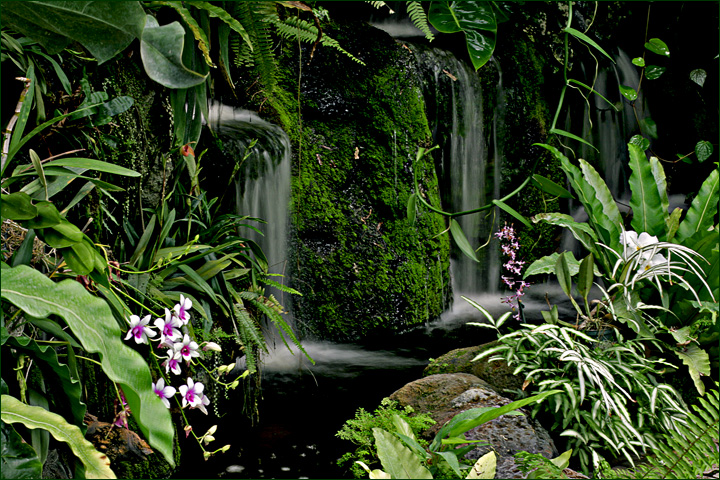
I like the bigger size (but don't tell Eric)! And yes it has more pop, but it makes the greyness of the falls greyer. I liked the original fine, and was quite taken with the subdued quality which gave it a distinctness. One suggestion might be to tone down whatever you did to give it pop just ever so slightly: could be my monitor but the whites are almost blown. |
|
 Photographer found comment helpful. Photographer found comment helpful. |
|
|
09/28/2008 02:47:49 PM |
|
You could as the other commented noted dodge the water to whiten it a bit. That said, I think the original exposure unedited is pretty darn good as it is! |
|
| Photographer found comment helpful. |
|
|
09/26/2008 06:37:30 PM |
|
I like your edit better. The pop that comes w/ the greens and the flowers is really nice. I would only say if you can push the falling water closer to white maybe would be worth a try. |
|
| Photographer found comment helpful. |
Home -
Challenges -
Community -
League -
Photos -
Cameras -
Lenses -
Learn -
Help -
Terms of Use -
Privacy -
Top ^
DPChallenge, and website content and design, Copyright © 2001-2026 Challenging Technologies, LLC.
All digital photo copyrights belong to the photographers and may not be used without permission.
Current Server Time: 06/28/2026 11:20:06 AM EDT.