| Author | Thread |
Comments Made During the Challenge  |
|
|
09/29/2008 12:16:26 AM |
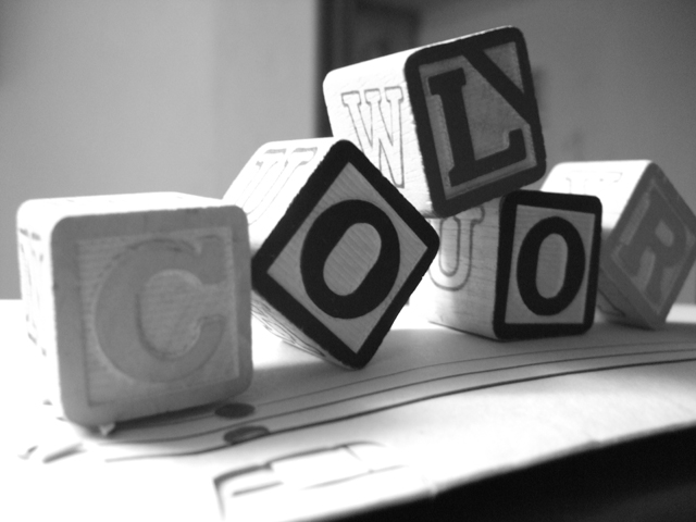
You're missing a "u". It's spelt C O L O U R ;)
Nice shot. |
|
|
|
09/28/2008 03:54:58 AM |
|
I like the idea here, but I think a bit more sharpness would help bring out the potential. |
|
|
|
09/26/2008 05:34:28 PM |
|
the lighting is kind of hard, maybe a little closer to the front and difused like you were going at a portrait. |
|
 Photographer found comment helpful. Photographer found comment helpful. |
|
|
09/25/2008 10:16:05 AM |
|
this is a nice picture, it does say color in black and white... great idea =) |
|
| Photographer found comment helpful. |
|
|
09/25/2008 01:04:56 AM |
Greta Idea. Those of us that spell Colour with a 'u' won't whinge too much.......only joking.
Great way of portraying colour, works well. Not sure about the dark area in the front right, and would have been great if the background did not have the dark like through it...... |
|
| Photographer found comment helpful. |
|
|
09/24/2008 10:09:01 PM |
|
The C and the R get lost since they are so much lighter than the other letters. I wonder if there would be a way to make them darker during the black and white conversion. |
|
| Photographer found comment helpful. |
|
|
09/24/2008 03:42:11 PM |
|
|
|
09/24/2008 01:13:45 PM |
|
Good idea, though I wish the C stood out a little more and that the R block's corner wasn't cropped off. |
|
| Photographer found comment helpful. |
|
|
09/24/2008 10:41:33 AM |
|
|
|
09/24/2008 10:36:08 AM |
|
|
|
09/24/2008 10:34:21 AM |
|
Very creative, yet has some blown out areas around the letter C. And it wouldn't hurt to be a little more clear. Over all i really enjoyed the photo, it shows black and white but says color. Most pictures like this would have come off as sort of humorous but this one has shown a more serious side to irony. I LOVED IT! |
|
| Photographer found comment helpful. |
|
|
09/24/2008 10:19:25 AM |
|
Home -
Challenges -
Community -
League -
Photos -
Cameras -
Lenses -
Learn -
Help -
Terms of Use -
Privacy -
Top ^
DPChallenge, and website content and design, Copyright © 2001-2026 Challenging Technologies, LLC.
All digital photo copyrights belong to the photographers and may not be used without permission.
Current Server Time: 06/28/2026 10:23:07 PM EDT.