| Author | Thread |
Comments Made During the Challenge  |
|
|
09/27/2008 10:09:51 PM |
|
Great shot, but looks like some banding in the sky? |
|
 Photographer found comment helpful. Photographer found comment helpful. |
|
|
09/27/2008 09:02:28 AM |
|
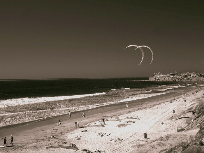
Nice find. I would have never thought of these as a letter "c" Good color effect too... |
|
| Photographer found comment helpful. |
|
|
09/23/2008 02:51:52 PM |
|
If you flipped the photograph horizontally, the "C"'s would be facing in the right direction. |
|
| Photographer found comment helpful. |
|
|
09/23/2008 12:12:11 PM |
|
what a great beach scene - nice job to see the Cs |
|
| Photographer found comment helpful. |
|
|
09/23/2008 11:59:19 AM |
|
they're facing the wrong way :) but i love the picture anyway (9) |
|
| Photographer found comment helpful. |
|
|
09/22/2008 07:37:07 PM |
|
if you tilt your head i see C's lol nice entry |
|
| Photographer found comment helpful. |
|
|
09/22/2008 03:45:06 PM |
|
| Photographer found comment helpful. |
|
|
09/22/2008 02:14:04 PM |
|
Shame the Cs are the wrong way round! Nice shot, there's something quite old fashioned about this scene that appeals to me. Not sure about the green tinge to the sky. |
|
| Photographer found comment helpful. |
|
|
09/22/2008 12:45:22 PM |
|
A closer crop would have emphasized the letters more, but still a nice shot. I like the sepia. |
|
| Photographer found comment helpful. |
|
|
09/22/2008 07:12:13 AM |
|
Love the tones in the shot, maybe if you had flipped the image then the C would be even more obvious , 7 |
|
| Photographer found comment helpful. |
|
|
09/22/2008 04:24:29 AM |
|
| Photographer found comment helpful. |
|
|
09/22/2008 12:39:58 AM |
|
Not that I care, but I would have inverted it so that the C's are truly that shape. I like it fine, but DPC voters are VERY literal. :~) Good luck. 7 |
|
| Photographer found comment helpful. |
Home -
Challenges -
Community -
League -
Photos -
Cameras -
Lenses -
Learn -
Help -
Terms of Use -
Privacy -
Top ^
DPChallenge, and website content and design, Copyright © 2001-2026 Challenging Technologies, LLC.
All digital photo copyrights belong to the photographers and may not be used without permission.
Current Server Time: 06/28/2026 03:45:23 PM EDT.