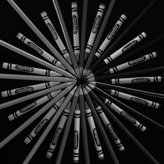
Nice interpretation. A different POV might have created some interesting depth and I might have sharpened all of the pencils to create a cleaner looking inner-circle. Still it's an effective interpretation of the challenge.
Great composition balance dark on one side, light on the other. Most people would just make a regular color wheel and when desaturated end up with a blend of darks and lights.
A good choice for the challenge topic - definitely conveys color! I think it could be just a tad lighter/brighter - a touch of levels or brightness/contrast perhaps.







 Add photograph to your favorites
 Add photographer to your favorites


 Photographer found comment helpful.


