| Author | Thread |
|
|
09/30/2008 08:01:48 PM |
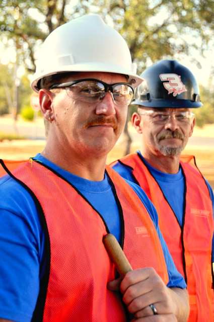
Mark,
I don't think the score reflects the potential of this shot. While the subject matter didn't have the kind of "hook" it takes to score the big numbers, it fits the challenge well enough to have scored higher. Usually you must have a great subject and solid technicals to score very well. Here, your subject was stronger than the technicals, yet both were okay.
Technicals: The composition is strong. The placement of your workers, their position and the way they fill the space work well overall. It feels just a bit too tight, especially on the top and right. We often see the eyes on the 1/2 to 1/3 line, so when the eyes are higher on your main subject, it feels off.
The DOF didn't quite work. On the men, it is a bit too shallow, with the hands soft and the main subject's eyes soft. Yet, on the trees, it is a bit too deep. This is a place where using the telephoto could make a difference as you get further from your subjects and place more space between them and the background.
As mentioned in the comments, you have some hot spots on your subjects' faces which indicated overexposure. The bright spot near the white hardhat also draws my eyes out to the intended subject.
The glare in the glasses distracts. Put the glasses at an angle to the camera to eliminate them as much as possible, either up, down or to the side.
Subject:I believe you could have had a stronger subject by changing the background to something that screamed, "Keep me safe!" such as road construction, near demo work or around heavy equipement. The generic trees didn't give you the added umph this subject could use. Without it, this image says workers to me, but not safety.
I like the colors and contrast betweeen the blue and orange. I'm not crazy about the dark hardhat as I'm not sure what the logo says/means and I feel like I'm missing something important in that.
It is good to see you get back to photography. Do not let this site get to you, as you have some very interesting shots. These small details can really make a difference in a shot and can often mean the difference of a full point or 2.
Thanks for sharing your image with us. I'm sure it will be appreciated on your publication.
Becky |
|
 Photographer found comment helpful. Photographer found comment helpful. |
Comments Made During the Challenge  |
|
|
09/22/2008 07:16:24 PM |
|
This picture seems overexposed, but only slightly. I like the framing and angle of the photo! |
|
| Photographer found comment helpful. |
|
|
09/19/2008 05:44:39 PM |
|
| Photographer found comment helpful. |
|
|
09/19/2008 04:41:38 PM |
|
| Photographer found comment helpful. |
|
|
09/19/2008 09:05:57 AM |
|
Good portrayal of safety. I think the eyes in the front person are a bit out of focus, I think the auto focus went to the goggles instead of the eyes. |
|
| Photographer found comment helpful. |
|
|
09/19/2008 08:25:29 AM |
Good lighting and strong colours. I like the way the image is composed also.
8/10 |
|
| Photographer found comment helpful. |
|
|
09/18/2008 09:08:03 PM |
|
Love the orange against the blue. My eyes are really drawn to the safety vests. Thanks for taking a shot that actually fits the challenge without some cutsey title to make it fit. |
|
| Photographer found comment helpful. |
|
|
09/18/2008 08:31:36 PM |
|
Good idea. I like the color arrangement. Perhaps the focus and exposure could be improved a little. |
|
| Photographer found comment helpful. |
|
|
09/18/2008 04:04:23 PM |
|
What, no flashing neon lights? Geez - safe indeed! Just kidding, nice find... |
|
| Photographer found comment helpful. |
|
|
09/18/2008 04:03:22 PM |
|
Good picture. The DoF could have helped a bit more I think. I would think the jackets would pop out even in a Black&White image.. and perhaps more strongly...IMHO.. Hint hint :-) |
|
| Photographer found comment helpful. |
|
|
09/18/2008 10:57:02 AM |
|
This is a nice portrait, the light hits off their glasses a bit but otherwise, the light is good. Bumping up :) |
|
| Photographer found comment helpful. |
Home -
Challenges -
Community -
League -
Photos -
Cameras -
Lenses -
Learn -
Help -
Terms of Use -
Privacy -
Top ^
DPChallenge, and website content and design, Copyright © 2001-2026 Challenging Technologies, LLC.
All digital photo copyrights belong to the photographers and may not be used without permission.
Current Server Time: 06/28/2026 02:11:36 PM EDT.