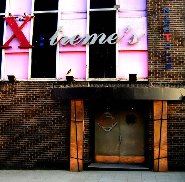
I really liked this - I think it has a surreal cross-processed look like you'd see in a Quentin Tarantino movie or some such. Otherworldly.
thanks - i think *i* liked it too, but the poxy thing did badly getting to 15th from last. should have cropped out the garish pink and stuck with the brick and the door... Oh hum, just another of a string of poor results. But thanks again for the post vote comment.
Composition: Subject Placement, Cropping, Background 4
Technical: Focus, Exposure, Lighting, Processing 6
Appeal: Is it Interesting, Motivating, Etc.? 3
How well does it meet the challenge: 5
Total Averaged Rating 4 Autool
Very interesting spot. I LOVE the bottom half - the bricks and the orange, gray and green work well together. Then there's the top where the garish colors clash so bad! Nicely exposed (and that was tough I'm sure) and seems very sharp throughout.







 Add photograph to your favorites
 Add photographer to your favorites


 Photographer found comment helpful.


