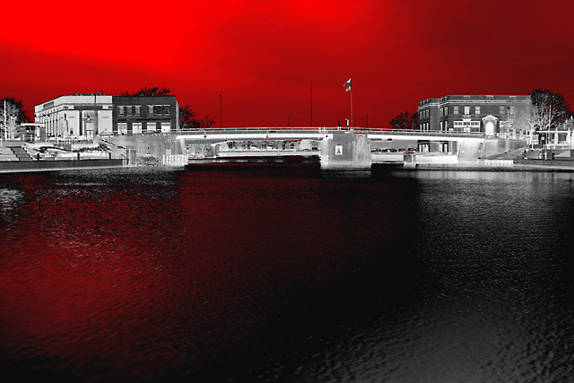
This one will be interesting. Out of the camera this image was rather flat, but I liked the wide stretch of water in front of the bridge. It was late afternoon and overcast, so I was able to get a full range of tones in Canon raw mode. I knew, of course, that it would need coaxing and tweaking.
I like grayscale and duotones, but am a complete beginner when it comes to applying the concepts in PS7. This image was first adjusted via levels, then converted to grayscale. I then converted to duotone with a slight blue-ish tint. After a slight contrast adjustment, I converted back to RGB.
I then started playing around with selective colors, specifically the white, gray, and black 'colors', manipulating the black and cyan sliders until I got the effect here.
I have no idea how this one will be received in the challenge. All I know is that I like it, and that it took a little doing to achieve it.
To all who view, vote, and/or comment: Thanks!
-len
Statistics
Place: 159 out of 176 Avg (all users): 4.6477 Avg (commenters): 4.2273 Avg (participants): 4.3942 Avg (non-participants): 5.0139 Views since voting: 1259 Votes: 176 Comments: 24 Favorites: 0
Wow. I don't like the red so much but it does make for an impressive effect. The buildings seem far away when I focus on them but the color effects you used help to mask that distance. Perhaps putting the bridge (lock?) higher so that it sits closer to a thirds line would help me with this. Regardless of the scoring it is a unique approach (or at least one I haven't seen in challenges in a long time). Way to get out of the box on this one.
It's a striking image. I'm not sure what you've intended by the angry sky though. It's quite heavy handed for what seems like a pleasant view, and the 'drama' seems out of place here to me.
It's a good composition too, so I feel a bit frustrated by this.
FAR too much fun with photoshop! It's certainly a dramatic shot, no question there. Purely on a personal taste, the way that the image has been so editted seems a bit excessive, but then i'd imagine there are others who will no doubt totally dig what you've done. I do acknowledge that it's been altered skilfully - the red in the water is an especially good touch. I wouldn't have polarised the buildings - I think that's thing that i can't quite digest. Sky is gorgeous though - I would have been tempted to crop it with two thirds sky, rather than two-thirds water. it just seems a little unbalanced. good brave effort though. 6.
Composition: Subject Placement, Cropping, Background 8
Technical: Focus, Exposure, Lighting, Processing 8
Appeal: Is it Interesting, Motivating, Etc.? 4
How well does it meet the challenge: 8
Total Averaged Rating 7 Autool
I think I'd personally have coloured it all in, rather than leaving the land in monochrome. There is some appeal for me in the effect, probably especially in the shade of red you've chosen ... but perhaps (and I'm searching for the right words to express my feelings about it here) it's rather more about the effect than the photograph.
I'm not sure I'm fond of the effects here. I'm not sure I understand the point behind them (I feel there should be a *point* to doing something like that).





 Add photograph to your favorites
 Add photographer to your favorites


 Photographer found comment helpful.


