| Author | Thread |
Comments Made During the Challenge  |
|
|
09/14/2008 05:47:49 PM |
|
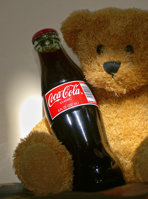
Nice concept. I like the message it displays. Hanging sheet in the background may have helped cut down the reflections in the bottle. |
|
|
|
09/11/2008 07:07:15 PM |
|
Framing and emphasis on the product with the natural light is a nice idea, but image lacks overall punch. |
|
 Photographer found comment helpful. Photographer found comment helpful. |
|
|
09/10/2008 05:24:42 PM |
|
The lighting on the bear is a bit much. |
|
| Photographer found comment helpful. |
|
|
09/09/2008 06:20:56 PM |
|
| Photographer found comment helpful. |
|
|
09/09/2008 04:59:07 PM |
Fit Challenge Criteria: 2/2
Contrast/Color: 0/2
Composition: 1/2
Photo Quality: 1/2
My Subjective Affinity: 0/2
The idea is great, but the execution leaves something to be desired. The lighting is extremely harsh. The attempt to make the label stand out with the lighting was a bit overdone. I find the cropping a bit too tight. I think this would have worked better placed further from the background, and had an extra light to completely white out the background. And then perhaps limited DOF instead of lighting to make the label on the bottle stand out. |
|
| Photographer found comment helpful. |
|
|
09/09/2008 03:00:40 PM |
|
the light looks just a bit strog, other than that, I think it really conveys the message you are trying to send! |
|
| Photographer found comment helpful. |
|
|
09/09/2008 09:59:24 AM |
|
Glare on the wall is a wee bit harsh. I like the crop on the teddy though. |
|
| Photographer found comment helpful. |
|
|
09/08/2008 10:25:29 PM |
|
good idea, but not exactly what everone is considering a product shot these days |
|
| Photographer found comment helpful. |
|
|
09/08/2008 12:50:49 AM |
|
I don't care for the lighting at all |
|
| Photographer found comment helpful. |
Home -
Challenges -
Community -
League -
Photos -
Cameras -
Lenses -
Learn -
Help -
Terms of Use -
Privacy -
Top ^
DPChallenge, and website content and design, Copyright © 2001-2026 Challenging Technologies, LLC.
All digital photo copyrights belong to the photographers and may not be used without permission.
Current Server Time: 06/29/2026 01:00:00 PM EDT.