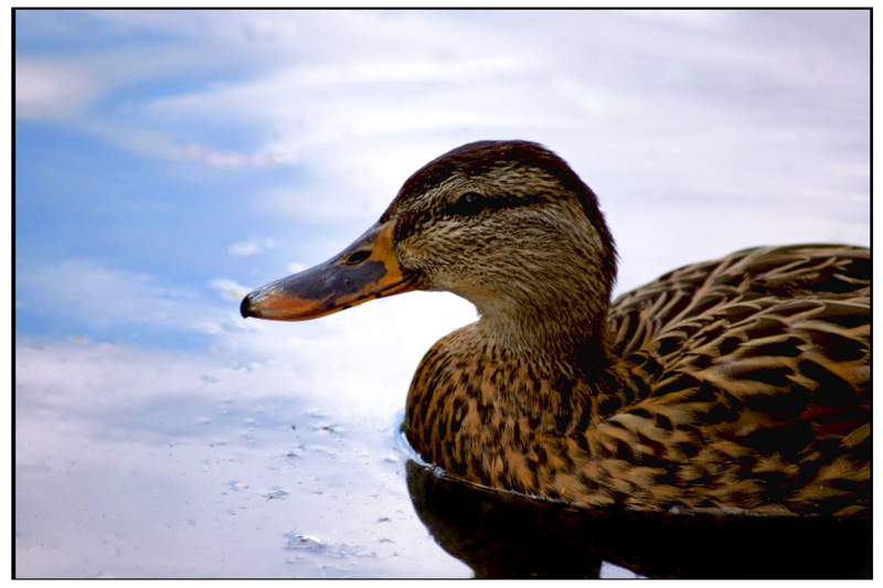
The only thing that is more or less unfixable (unless you have loads of free time to invest in some really tedious clone tool work) is the blown out portion of the background. Lousy spot for it too, keeps dragging my eyes off the duck's face and onto the water below it. Other than that it looks good. Sharpen it a bit, kick up the colors a bit, you've got a decent entry for the next What The Duck challenge!
I like this picture. It follows many of the rules of photography, but has a hard time standing out in this particular crowd as above average. The problem areas (as I see them) are not necessarily within your control before the PP stage with this shot, however. They are lighting, distractions, and human nature.
First is the darkness around the eyes of the subject. (In this case it happens to be a duck, but the eyes are critical in any shot of a live specimen.)
Next, would be the distracting elements around the subject. (Yep, subject is still a duck!) Specifically, the stuff floating in the water in front of him. This could be removed in post, but not (I fear) if you want to follow the challenge rules. (As an aside, I have found that trying to get a shot within the rules of this site has made me a better photographer. It has meant that I have to get things right in camera, not rely on post processing!)
More importantly is the relative brightness of the water around him. (Yes, it's an assumption that it's actually a 'him', but what do I know about ducks?) Point is, the eye is naturally drawn to the brightest areas in an image first. Once they've been found, your main subject has to be interesting enough to draw the eye away (if you have chosen to break this rule. . . and in this case, I think you have. Did I mention that the subject is a duck? Not interesting enough in my opinion to draw the eye back.)
Ok, now the good stuff! First, it's a duck and I think ducks are cool. :)
Next, the focus is dead on, and the level of detail is great.
Then, we'll talk about the color. Both on the duck itself (himself?) and in the water. It looks like you have amped them up in post processing, but that you have avoided the mistake (which I still make!) of going too far. The overall feeling is a soothing, calming one.
I agree about the eye: a very localized and subtle lightening there would be good, think.
DPCers have a love/hate relationship with borders, it seems. I don't generally care for them, but on occasion they really seem to work well. For this image, I guess if pressed I would say that the border seems irregular, and the black inner border probably causes that effect: it seems wider along the lighter edges of the image, and then seems to merge and "thin out" as it reaches the dark areas. Optical illusion no doubt, but it almost looks poorly matted. It is, to me, a bit distracting.
The varying thickness of the white border from (horizontal vs vertical) also makes me a bit tense. Now, to be clear, I normally just don't even look at the borders, but since it has been mentioned, I did look more closely since you have requested comments. In a voting round, for example, I doubt that I would consciously notice the aberrations in the border.
The reflection of the sky seems a little off-color to me--a bit too magenta, perhaps? Playing with your white balance or "temperature" slider might be worth a go just to see what you get.
Probably the thing I would do for certain if this were my image (which it is not!) is crop up from the bottom just a bit to eliminate the little triangular light bit in the reflection of the duck's neck/body juncture--only just enough to eliminate it, and no further.
Goes without saying (well, here I go saying it anyway) that this is your image, so it should ultimately be what you want it to be, and not what any of us say we like. But take the comments as things to experiment with if they ring true to you, discard them freely if you don't like the results. You have a strong portfolio already, sir, so trusting your own judgement is a safe bet :-)
would like to see a little brighter on the face of the duck, just can't pick out enough features to be really interesting. also needs to be a little sharper. crop is good for me though. good image either way.
I would like to see the duck's eye better. By this I mean brighten it a little. Another nitpick is the border. The black runs in with the duck and gets lost. I would try reversing it or just do a white border. It is a good photo. Keep up the great work.