Convert from RAW, Levels, Curves, selective color adj for reds, brightness/contrast adjustments, more selective color, more contrast, sharpen, resize, border, save
Statistics
Place: 248 out of 487 Avg (all users): 5.6728 Avg (commenters): 6.5000 Avg (participants): 5.6240 Avg (non-participants): 5.8378 Views since voting: 1103 Views during voting: 230 Votes: 162 Comments: 10 Favorites: 1 (view)
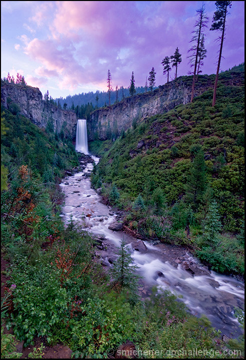
It's a very pretty shot, but it's lacking something in terms of lighting - seems kind of flat to me. I gave it a 6, so it was above average, but there's a lack of contrast overall. Perhaps a little dodging and burning would do the trick. I sometimes have this same problem with my own photos - they just don't pop well enough.
This is a very pretty photo. At the same time, there is just so much here for an image this size. If this were a travel poster taking up a good portion of a wall, it could work much better.
The colors are beautiful, but the picture is very busy and at this scale there is a lot of competition going on.
The stream tries to act as a leading line. But it is broken up a bit upstream by the rocks, and the brilliant colors along the stream side, pull the eye away. When the eye gets to the waterfall, the sky immediately pulls the eye away. It is hard for the eye to rest on a focal point anywhere in this picture. Is it the stream, the waterfall, the clouds that I am supposed to look at? All are competing for a starring role, as opposed to supporting each other.
Again, the picture itself as a whole is beautiful. If the scale were larger, it would surely come across better.
I gave this a 7 and enjoyed this pic. I think it scored lower than a 6 (unfairly so, IMO) b/c the details in the trees and bushes looks too fuzzy and granulated somehow, and b/c of the slightly unrealistic color scheme. It just has too much Magenta in it, perhaps this could it could be fixed by setting a 'black point' with the eye dropper in curves. Or by going into selective color and going into the neutrals and pumping more black into them. I like 'unrealistic' shots and i think the composition is just great here, but somehow it looks like there is an accidental magenta cast rather than a deliberate attempt at making the picture magenta. Still, I would have pegged this at a 6.3 i don't get how it scored so low!
I would have included more sky. The crop cuts off the tree in the right hand side of the photo as well. There is something about the colours. It looks as though (on my screen) that the cliffs are slightly pink, which may have been when you adjusted the reds for the sky. Some extra work experimenting with the selective colour could have helped, either to further bring out the red in the sky (and sending the cliffs further pink for the evening reflective look) or to reduce pink inthe cliffs. Also, a level adjustment prehaps to give it more feel, more evening as well (slightly darken)
Oh well, my 2 cents............
not sure about the title, lol! but i love the image, the colors are beautiful, and you did a great job capturing the right amount of movement in the water.





 Add photograph to your favorites
 Add photographer to your favorites

 Photographer found comment helpful.


