| Author | Thread |
|
|
09/01/2008 08:22:59 PM |
Critique Club Review:
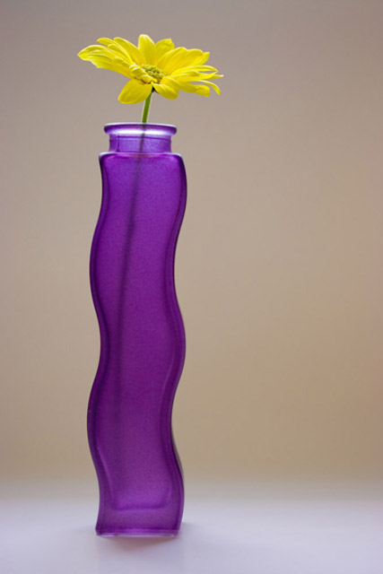
Color Saturation and Hue: Colors are pleasing, and nicely saturated. Best of all, not over done, as is all too often the case with bright flower pictures. Hues are nice and natural.
Brightness and contrast: Image is bright enough, contrast could be a little higher.
Focus and depth of field: Focus appears a little soft. There does not seem to be a real point of sharp focus. Depth of field may be a bith shallow at this f-stop and a contributor to the effect.
As already noted by others, the small file size has hurt you. Jpeg is a "lossy" compression algorythm, meaning that the more you compress, the more you lose in detail, and artifacts of compression creep in. Check your settings when you save. (I don't have Lightroom) but there should be an option to control file size and quality. You want it as close to 150 K in the open challenges as you can get, to preserve all the detail.
The yellow flower does compete for attention as the subject of the image, so some of the purists may have voted you a bit lower if they felt the flower was the subject rather than the vase.
All in all, a well balanced, peaceful image. I could see it in an office or a magazine. It would also make a nice entry for the current catalog challenge as a picture for a vase on sale. |
|
 Photographer found comment helpful. Photographer found comment helpful. |
Comments Made During the Challenge  |
|
|
08/26/2008 10:13:27 PM |
|
The colours are very complimentary, the vase is groovy. |
|
| Photographer found comment helpful. |
|
|
08/25/2008 06:56:45 PM |
|
| Photographer found comment helpful. |
|
|
08/24/2008 04:40:28 PM |
|
This could have, should have been much larger file size, and image quality, then sharpened for crisp focus on the subject. Composition, lighting and colors are very nice. |
|
| Photographer found comment helpful. |
|
|
08/23/2008 11:26:06 PM |
|
simple yet elegant. beautiful photo. |
|
| Photographer found comment helpful. |
|
|
08/23/2008 03:53:18 AM |
|
Simple elegance. Great shot. |
|
| Photographer found comment helpful. |
|
|
08/22/2008 03:33:57 PM |
|
I LIKE this one! This would make a very nice print -- great big -- in a very modern setting. |
|
| Photographer found comment helpful. |
|
|
08/21/2008 10:16:27 PM |
|
Good composition but not the cleanest of images. |
|
| Photographer found comment helpful. |
|
|
08/20/2008 01:50:19 AM |
|
| Photographer found comment helpful. |
Home -
Challenges -
Community -
League -
Photos -
Cameras -
Lenses -
Learn -
Help -
Terms of Use -
Privacy -
Top ^
DPChallenge, and website content and design, Copyright © 2001-2026 Challenging Technologies, LLC.
All digital photo copyrights belong to the photographers and may not be used without permission.
Current Server Time: 06/29/2026 01:44:51 PM EDT.