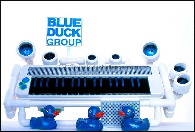
Last time there was the Ducky Challenge my husband commented that I should have done "Blue Duck Group". As that I had already done Amelia Duckhart I filed the idea away for next time. Well here is the Ducky II and here comes Blue Duck Group! I spray painted the ducks a bright shiny blue and printed out the Banner and stuck it on the back of a upside down wine glass. The music keyboard is actually the Blue Man Group Keyboard. I propped it up carefully on an angle using a thin board and upside down clear plastic wineglasses on either side (the glasses are positioned carefully behind the white tubing and even though they stuck out a tad the extra bright lights positioned behind and longer exposure made them disappear.
The Blue Man Group wears all black with just their heads visible as a bright shiny blue. Because of that I know that some are going to comment that the Ducks are naked, but OH WELL! Can't be perfect:-) And they are not naked, they are wearing plastic feathers:-)
Looks simple right? 3 Photoshoots! 3 Photoshoots to get the damn thing right. And this was over three days. Lighting, lighting, lighting was the headache. Once I finally got the lights configured correctly the backdrop was exposed at close to white so I had very little to do PP wise to get a high key/studio look.
Statistics
Place: 29 out of 151 Avg (all users): 6.0374 Avg (commenters): 7.1429 Avg (participants): 5.7458 Avg (non-participants): 6.1719 Views since voting: 1491 Views during voting: 301 Votes: 187 Comments: 10 Favorites: 0
I like it a lot - gave it a 7. Crop could be tighter at the top. And I DO know this was a spoof of the Blue Man Group and unlike the under-a-rock residents, I know who they are. ;-)
All that said, I think your Ducktor shot above might have done a little better. Always hard to say though.
I enjoyed your detailed description. I am starting to see the amount of work that some people put into their entries. I thought spending the better part of a Saturday was a lot of time. I'm still an amateur!
Nice original idea, I marked you down one point for composition though as I feel cutting off the ducks but leaving so much space at the top was a bit of a mistake.





 Add photograph to your favorites
 Add photographer to your favorites


 Photographer found comment helpful.


