| Author | Thread |
Comments Made During the Challenge  |
|
|
10/19/2002 02:24:00 PM |
|
|
|
10/19/2002 09:58:00 AM |
Composition: Subject Placement, Cropping, Background8,
Technical: Focus, Exposure, Lighting, Processing7,
Appeal: Is it Interesting, Motivating, Etc.? 7,
Total Averaged Rating7. Autool
|
|
 Photographer found comment helpful. Photographer found comment helpful. |
|
|
10/18/2002 07:38:00 PM |
|
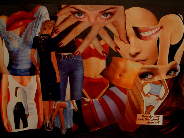
Nice collage! (Youth, for the most part) 7 Swash |
|
|
|
10/17/2002 09:37:00 PM |
|
too messy & cluttered. Poor color & light. |
|
|
|
10/17/2002 07:52:00 PM |
|
Good concept, but needs light. |
|
|
|
10/17/2002 03:44:00 PM |
|
surprised you don't see more of this kinda stuff on this site. i like. |
|
|
|
10/17/2002 05:36:00 AM |
|
|
|
10/16/2002 04:59:00 PM |
|
One of the three best of the week. The collage is fantastic. Everytime you look at it, a different part of the photo catches your eye. The beauty in the long black dress adds length and continuity to the photo and I love the guy with his head through the opening in the girl's dress. 10! |
|
| Photographer found comment helpful. |
|
|
10/15/2002 03:24:00 PM |
|
too dArk, needs a bit more soft lighting plus its too busy! |
|
|
|
10/15/2002 08:19:00 AM |
|
Good idea! The skin tones are a bit too orange. Maybe more light could haveeliminated it some. |
|
| Photographer found comment helpful. |
|
|
10/14/2002 09:53:00 PM |
|
did not get that idea until i read the words. |
|
|
|
10/14/2002 09:14:00 PM |
|
Composition: Subject Placement, Cropping, Background 7 , Technical: Focus, Exposure, Lighting, Processing 6 , Appeal: Is it Interesting, Motivating, Etc.? 7 , Total Averaged Rating 7 . smshats |
|
| Photographer found comment helpful. |
|
|
10/14/2002 06:10:00 PM |
|
interesting idea. it's a bit dark though, IMO. |
|
|
|
10/14/2002 05:50:00 PM |
|
Nice composite image, but it could use a little brightening up. I really do like the concept. |
|
|
|
10/14/2002 03:33:00 PM |
|
Well executed, but lighting oculd be better. And this idea has been done over and over again. For the cliche, I can only give it a 4. Sorry. |
|
|
|
10/14/2002 02:37:00 PM |
|
Great concept and execution, one of my few high marks this week. |
|
|
|
10/14/2002 08:47:00 AM |
|
Great concept, but it needs a bit more work. Fill in the edges of the photo so the collage appears from edge to edge, and turn up the lights a bit.. .this might be tricky to do with out glare. Good shot though-.. I really love the concept of this shot. |
|
| Photographer found comment helpful. |
|
|
10/14/2002 03:07:00 AM |
|
Brighter levels would have helped. |
|
| Photographer found comment helpful. |
Home -
Challenges -
Community -
League -
Photos -
Cameras -
Lenses -
Learn -
Help -
Terms of Use -
Privacy -
Top ^
DPChallenge, and website content and design, Copyright © 2001-2026 Challenging Technologies, LLC.
All digital photo copyrights belong to the photographers and may not be used without permission.
Current Server Time: 06/27/2026 08:33:03 PM EDT.