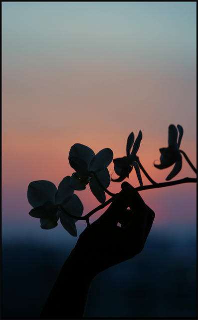
I like this overall. I think though that it would have been nice to have a little more light/room at the bottom. The sillouette and the hand are so close to the full-black area.
The loss of contrast at the wrist and arm kills it for me, I'm afraid. A very good idea and I love the coloring, but I think it would have been better if held at a point just out of the frame.




 Add photograph to your favorites
 Add photographer to your favorites


