| Author | Thread |
Comments Made During the Challenge  |
|
|
10/19/2002 09:55:00 AM |
Composition: Subject Placement, Cropping, Background7,
Technical: Focus, Exposure, Lighting, Processing6,
Appeal: Is it Interesting, Motivating, Etc.? 5,
Total Averaged Rating6. Autool
|
|
|
|
10/19/2002 06:34:00 AM |
|
|
|
10/18/2002 12:53:00 PM |
|
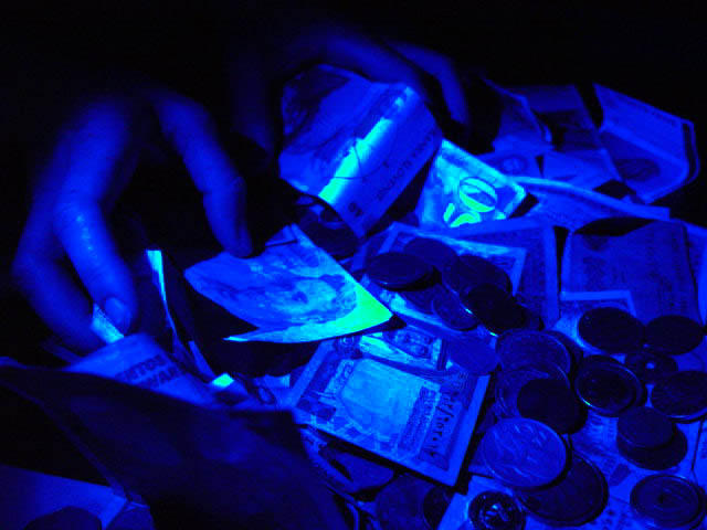
Interesting, but too blue. The money has some really cool stuff going on, but loses so much detail. Was this from a black light? The bills take on an eiry feel, but the coins aren't to my liking. 7 Swash |
|
|
|
10/16/2002 10:56:00 PM |
|
Different...Would have liked it a little lighter blue. |
|
|
|
10/16/2002 12:59:00 PM |
initial reaction -- how do i know it's selfish and beyond reason from looking at the photo? but then, it's not a title competition ...
challenge -- met
technical -- i'm sure it was intentional, but the photo is too blue and dark for my liking. some of the highlights (next to the face, the 50) are too strong.
composition -- like how the hands are in the corner and most of the photo is jumbled up money. like that you added coins and didn't just use notes.
overall -- 5 from gr8photos |
|
|
|
10/15/2002 10:03:00 PM |
|
The blue light is cool, but it doesn't seem to add to the pic for me... 6 nards656 |
|
|
|
10/15/2002 08:33:00 PM |
|
I think the tint takes away from the photo |
|
|
|
10/15/2002 03:05:00 PM |
|
|
|
10/15/2002 12:48:00 PM |
|
Composition: Subject Placement, Cropping, Background 6 , Technical: Focus, Exposure, Lighting, Processing 4 , Appeal: Is it Interesting, Motivating, Etc.? 5 , Total Averaged Rating 5 . smshats |
|
|
|
10/14/2002 09:51:00 PM |
|
the picture doesn't say that to me. |
|
|
|
10/14/2002 09:50:00 PM |
|
This is one of the better done money shots of the week. The lighting seems to work really well in this shot. The shot is busy, but my eyes are still drawn to the upper corner where the hands are. Nice job! - JB |
|
|
|
10/14/2002 08:58:00 PM |
|
|
|
10/14/2002 07:19:00 PM |
|
The blue lighting is very unique, and the glow the light gives off is even better. I just wish this shot wasn't so pixelated or blurry. I bumped my score because of this. |
|
|
|
10/14/2002 05:33:00 PM |
|
I've seen several version of theis photo. Nice blue. |
|
|
|
10/14/2002 08:52:00 AM |
|
the blue doesn't really work in this photo.. too dark, not interesting enough. |
|
|
|
10/14/2002 04:23:00 AM |
|
It happens. Good luck Justine |
|
Home -
Challenges -
Community -
League -
Photos -
Cameras -
Lenses -
Learn -
Help -
Terms of Use -
Privacy -
Top ^
DPChallenge, and website content and design, Copyright © 2001-2026 Challenging Technologies, LLC.
All digital photo copyrights belong to the photographers and may not be used without permission.
Current Server Time: 06/28/2026 02:42:45 AM EDT.