| Author | Thread |
|
|
07/25/2008 01:35:51 PM |
Originally posted by Hatchet:
NOTE TO SELF.....
NEVER EDIT YOUR ORIGINAL..
NEVER EDIT YOUR ORIGINAL..
NEVER EDIT YOUR ORIGINAL.. |
If you use Lightroom, you can make it save two different copies of your images when uploading them to your computer.
What was it scoring? And why was this being asked to be validated?
Wait, I see it now, the border that looks like a vignette most probably. Tough luck. It was a nice shot except for that highlight on the bg. |
|
 Photographer found comment helpful. Photographer found comment helpful. |
|
|
07/23/2008 12:43:48 PM |
NOTE TO SELF.....
NEVER EDIT YOUR ORIGINAL..
NEVER EDIT YOUR ORIGINAL..
NEVER EDIT YOUR ORIGINAL..
|
|
Comments Made During the Challenge  |
|
|
07/22/2008 04:48:17 PM |
|
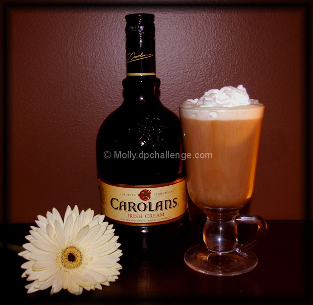
Nicely composed but the lighting needs softening and evening out. |
|
| Photographer found comment helpful. |
|
|
07/20/2008 01:58:19 PM |
|
im not sure but i think thats the flash lighting the neck of the glass and some of the bottle :), personally i would have tried another light source i think its a bit too dark :S is that sunlight directed fr0m the right? |
|
| Photographer found comment helpful. |
|
|
07/20/2008 01:14:56 PM |
|
The gerber daisy balances out the colors nicely! |
|
| Photographer found comment helpful. |
|
|
07/20/2008 02:57:55 AM |
|
its a little dark, and flash put some reflections on the glass. but i like the setuup and way the drink is displayed. thanks for sharing |
|
| Photographer found comment helpful. |
|
|
07/18/2008 12:19:26 AM |
|
Oh yeah, I'll have me one of those please :) The background's not so appealing though. Maybe moving it a bit further away would have been better? |
|
| Photographer found comment helpful. |
|
|
07/17/2008 11:15:26 PM |
|
Looks tasty, nice presentation and overall tone. Flash/light is too harsh and removed the depth of the bottle neck. I say give this another go with improved lighting and a little more space between the subject and background. Ahh, one last thing, your arrangement screams for a sharp flower, so more DOF would improve the subjects. Just an FYI, you may get called out for the border. I'm off to have a coffee! ;) |
|
| Photographer found comment helpful. |
|
|
07/17/2008 04:54:53 PM |
|
i like the setup, but the wall is distracting with the light glare off of it. not sure what the flower has to do with it though. may have just been added for decoration though. so overall, a nice job |
|
| Photographer found comment helpful. |
|
|
07/16/2008 12:24:05 AM |
|
First thing that hits me? The tilt to the left. |
|
| Photographer found comment helpful. |
Home -
Challenges -
Community -
League -
Photos -
Cameras -
Lenses -
Learn -
Help -
Terms of Use -
Privacy -
Top ^
DPChallenge, and website content and design, Copyright © 2001-2026 Challenging Technologies, LLC.
All digital photo copyrights belong to the photographers and may not be used without permission.
Current Server Time: 06/27/2026 10:26:30 AM EDT.