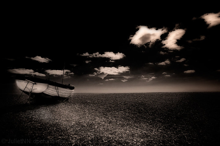
I am pretty amazed that this was placed where it was. I am thrilled. I thought it would definetly be at the bottom of the pack. I love just how simple this is. But I agree with everyone on here. On Photoshop, this was not as dark as it is on here, so adjusted it a tad and it looks better.
Statistics
Place: 190 out of 524 Avg (all users): 5.7976 Avg (commenters): 5.8333 Avg (participants): 5.7442 Avg (non-participants): 5.9744 Views since voting: 822 Views during voting: 227 Votes: 168 Comments: 14 Favorites: 0
I love PP, i really do, but I think the darkness of this is too much even for me! I love the clouds and like the idea, i just think the transitions are a little too obvious. Still a very respectable showing!
The deliberate choice for a very dark processing is excellent, it changes a (probably) just decent image into something strong, moody, near abstract in the sky.
Not sure eveyone will appreciate, but I'm in the high-rater here







 Add photograph to your favorites
 Add photographer to your favorites

 Photographer found comment helpful.


