| Author | Thread |
Comments Made During the Challenge  |
|
|
07/15/2008 03:30:06 PM |
|
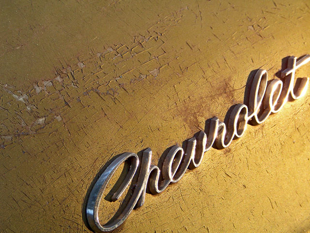
Interesting angle - too bad about the harsh lighting near the end of the word |
|
|
|
07/13/2008 10:25:58 AM |
|
cool old emblem, I like the gleam. I do feel the crop is tight on the chevrolet though. |
|
|
|
07/11/2008 07:08:35 AM |
|
Crop seems too close for my taste. |
|
|
|
07/10/2008 07:21:38 AM |
|
I like how the light really makes the emblem gleam- looks great with the paint (or at least what's left of it) color. Might've cropped it a TINY bit less so the bit of the T & C wasn't cut off. |
|
|
|
07/09/2008 06:23:22 PM |
|
I have mixed emotions on this, good color and I like the angle of "Chevrolet". I find the light on the right top side to be distracting. If I were you and taking this again, I would have tried to suppress that light somehow. The varying levels of light adds to the image, the harshness and reflections hurt. |
|
Home -
Challenges -
Community -
League -
Photos -
Cameras -
Lenses -
Learn -
Help -
Terms of Use -
Privacy -
Top ^
DPChallenge, and website content and design, Copyright © 2001-2026 Challenging Technologies, LLC.
All digital photo copyrights belong to the photographers and may not be used without permission.
Current Server Time: 06/27/2026 03:30:41 PM EDT.