I think this is a point of color, but i really have no idea. I am looking forward to every one's interpretation on this challenge. I just hope that I don't do crappy.
Photoshop was convert from RAW, duplicate layer (screen @ 50%), curves, flatten, usm, save for web. I wanted to make sure not to do any color adjustments as those were heavily debated in the forum on this challenge, And so that kept the steps low.
P.S. - She loves me.
Statistics
Place: 18 out of 200 Avg (all users): 6.3097 Avg (commenters): 5.8333 Avg (participants): 6.0690 Avg (non-participants): 6.4536 Views since voting: 1491 Views during voting: 272 Votes: 155 Comments: 9 Favorites: 1 (view)
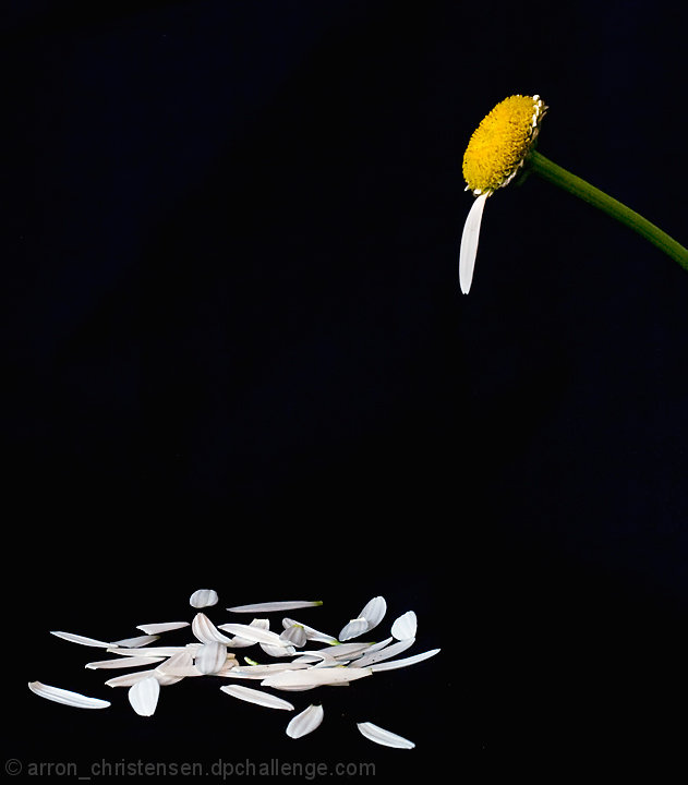
Color, Saturation and Hue: Colors are excellent. Nothing is over saturated and the hues are accurate for the subject.
Brightness and contrast: Brightness is good. Contrast is good as well. I really like the inky black of the background. There is one little nit to pick here. In between the two petals closest to the bottom of the image, there is a little dot, right in the middle about aligned with the top of the right petal. It's really insignificant, and at first I thought it was dirt on my monitor. Some of the white petals seem to lose some detail. But most have plenty of detail.
Focus and depth of field. Focus is very good, and depth of field is appropriate for this subject.
I like this picture a lot! Great use of negative space. I like the saturation of the yellow and greens here. The colors really pop in this image.
In the voting I gave this picture a 9, and I'm a little suprised that it did not finish even higher.
Congratulations on a very well deserved top ten finish.
This is exactly the kind of photo (I think) that fits this challenge to a T. Everything in B&W except one place. Very nicely done. Not voting, just commenting. Good luck!!
I like the set-up. IMO it would have been better if the flower head was closer to the "third" intersection and the head and petals were closer together.






 Add photograph to your favorites
 Add photographer to your favorites

 Photographer found comment helpful.


