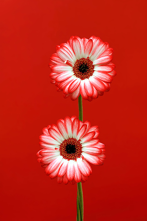
Well........you can take this image how you like....maybe the point of colour is all the red....maybe it is the white....maybe it is the green....but whatever...it fits the damn challenge!
Statistics
Place: 38 out of 200 Avg (all users): 6.1208 Avg (commenters): 7.0000 Avg (participants): 5.7241 Avg (non-participants): 6.3736 Views since voting: 1134 Views during voting: 263 Votes: 149 Comments: 10 Favorites: 0
This is quite beautiful. Love the color. As the challeng theme goes, the green is standing out as the point of color, not the reds. Challenge theme aside this works really well for me. The colors looks great, the flowers not overly saturated. Nice detail too.
Not quite sure how it fits the title of the competition but the picture is very nice. Pity you didn't straighten the small, bent petal bit otherwise a nice shot.
This interpretation is almost opposite of the challenge, but it works quite nicely. By making everything the atonal red, the green of the stems and the white of the floral hearts actually makes the flowers come alive.
This is extremely counterintuitive and suggests that you have a gift for artistic design.






 Add photograph to your favorites
 Add photographer to your favorites


 Photographer found comment helpful.


