| Author | Thread |
|
|
07/17/2008 12:30:57 PM |
|
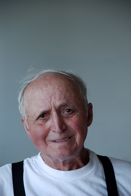
This is a wonderful engaging refreshing portrayal. The expression and lighting and framing which make the composition (lines, shapes, spaces) work extremely and subtly well. |
|
 Photographer found comment helpful. Photographer found comment helpful. |
|
|
07/16/2008 01:31:41 PM |
i think the compo showed a lot of guts
certainly it is not the old fashioned way but quit
refreshing
carry on your own thing
anyway thats all we can do
right |
|
| Photographer found comment helpful. |
|
|
07/16/2008 09:47:42 AM |
|
This should have placed much higher. The composition is strange with so much room above his head (which is why I assume this placed so low), but I don't think it would have worked nearly as well had you used traditional composition. I like this shot a lot. |
|
| Photographer found comment helpful. |
|
|
07/16/2008 06:51:19 AM |
|
I had given this a 7. A tighter crop and maybe some additional processing (sharpen, NI?) would have improved bit, I think. I wonder how it would look in black and white? |
|
| Photographer found comment helpful. |
Comments Made During the Challenge  |
|
|
07/15/2008 09:31:48 PM |
|
I love the picture and the look in his eyes. I think the lighting seems dark and there's a lot of space above his head. |
|
| Photographer found comment helpful. |
|
|
07/12/2008 12:08:29 PM |
|
Great crop, ok lighting. Love to see it with a bit more contrast or reshot with less soft light. |
|
| Photographer found comment helpful. |
|
|
07/12/2008 12:00:20 AM |
|
The more I look at this image the more I like it. I don't think it's so much the quality of the image as it is the expression on his face. |
|
| Photographer found comment helpful. |
|
|
07/10/2008 04:40:24 PM |
|
very "national geographic - esque" |
|
| Photographer found comment helpful. |
|
|
07/10/2008 10:02:06 AM |
|
I wish you had cropped more of the top so I could better see grandpa's face (better use of space) but, I think the lighting you used enhanced the texture of the subject. well done |
|
| Photographer found comment helpful. |
|
|
07/09/2008 12:24:21 PM |
|
Interesting crop (or framing). I'm not sure I like it, but it surely graps your attention. |
|
| Photographer found comment helpful. |
|
|
07/09/2008 11:30:19 AM |
|
Very nice shot. There is a bit too much dead space on top. I think a tighter crop would look better. |
|
| Photographer found comment helpful. |
|
|
07/09/2008 09:35:46 AM |
|
A good shot but IMO it might have been better to close up on the subject. There is lots of weathering there! |
|
| Photographer found comment helpful. |
|
|
07/09/2008 07:26:52 AM |
|
I would have cropped the top of the image, also contrast is lacking so the "age" doesn't pop out |
|
| Photographer found comment helpful. |
|
|
07/09/2008 03:36:07 AM |
|
I really like the subject, and it is an interesting cropping |
|
| Photographer found comment helpful. |
|
|
07/09/2008 12:20:33 AM |
|
i think this is a very cute image. it makes me smile :) |
|
| Photographer found comment helpful. |
Home -
Challenges -
Community -
League -
Photos -
Cameras -
Lenses -
Learn -
Help -
Terms of Use -
Privacy -
Top ^
DPChallenge, and website content and design, Copyright © 2001-2026 Challenging Technologies, LLC.
All digital photo copyrights belong to the photographers and may not be used without permission.
Current Server Time: 07/01/2026 03:02:35 PM EDT.