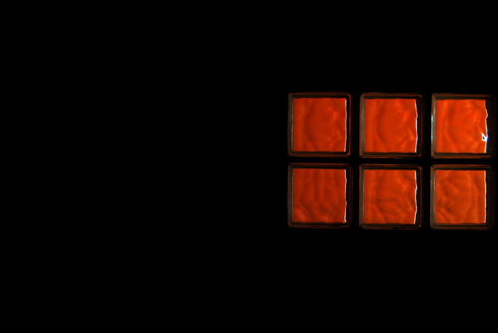
interesting abstract. I'm not sure I like the white lines on the right side of the red squares--it looks like an overshapening artifact... otherwise, it does have visual interest to me.
I like the colour graduation of the blocks. I find the composition to be lacking something though, IMO. Perhaps if the central line of the blocks was not so horizontally centered, it would be more esthectically pleasing.
I don't like the crop. Negative space is great, but with the six cubes placed at the right, they don't even extend over the halfway point of the image. Use negative space judiciously.





 Add photograph to your favorites
 Add photographer to your favorites


 Photographer found comment helpful.


