| Author | Thread |
|
|
07/14/2008 02:00:48 AM |
|
thanks for the comments, thanks |
|
Comments Made During the Challenge  |
|
|
07/12/2008 02:50:46 PM |
|
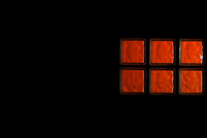
interesting abstract. I'm not sure I like the white lines on the right side of the red squares--it looks like an overshapening artifact... otherwise, it does have visual interest to me. |
|
 Photographer found comment helpful. Photographer found comment helpful. |
|
|
07/12/2008 07:16:18 AM |
|
| Photographer found comment helpful. |
|
|
07/10/2008 03:30:51 AM |
Incorrect.....
Its an 8 from me
beautiful shot that meets the challenge wonderfully
(I wonder how many other awful 'jokes' you got about the title? Sorry you are probably sick of them by now, I just could not help myself) |
|
| Photographer found comment helpful. |
|
|
07/08/2008 08:10:25 PM |
|
Interesting, is that a window, well what ever it is I like it. |
|
| Photographer found comment helpful. |
|
|
07/07/2008 12:20:31 PM |
|
love this except for that hot spot top right. So perfectly modern. :) 8 |
|
| Photographer found comment helpful. |
|
|
07/07/2008 10:22:12 AM |
|
I like the colour graduation of the blocks. I find the composition to be lacking something though, IMO. Perhaps if the central line of the blocks was not so horizontally centered, it would be more esthectically pleasing. |
|
| Photographer found comment helpful. |
|
|
07/07/2008 01:03:12 AM |
|
I don't like the crop. Negative space is great, but with the six cubes placed at the right, they don't even extend over the halfway point of the image. Use negative space judiciously. |
|
| Photographer found comment helpful. |
Home -
Challenges -
Community -
League -
Photos -
Cameras -
Lenses -
Learn -
Help -
Terms of Use -
Privacy -
Top ^
DPChallenge, and website content and design, Copyright © 2001-2026 Challenging Technologies, LLC.
All digital photo copyrights belong to the photographers and may not be used without permission.
Current Server Time: 07/01/2026 02:33:43 PM EDT.