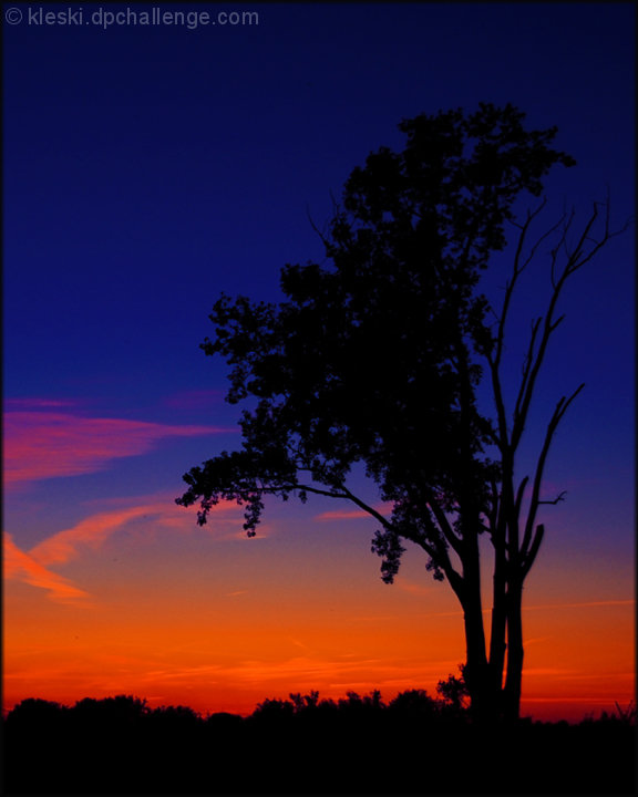
This is not a bad image, and many people have voted the striking colours well. For me, the colours are just a little too super-saturated neon, and they lose the natural feel. I'm also not a fan of high contrast, and prefer to see more visible detail in the subject. However, you have done well with your sillhouettes in the past, and I guess for very specific shots, they work well. I guess the difference here is that with the dark sky, the tree is not so visible against the background. Also, a tree as a subject never grabs a viewer like a human silhouette.
As mentioned in other comments, the title is a little odd for this image, and rather than adding a new dimension to a sunset image, it is a mental twist to make the image and the title fit together.





 Add photograph to your favorites
 Add photographer to your favorites

 Photographer found comment helpful.


