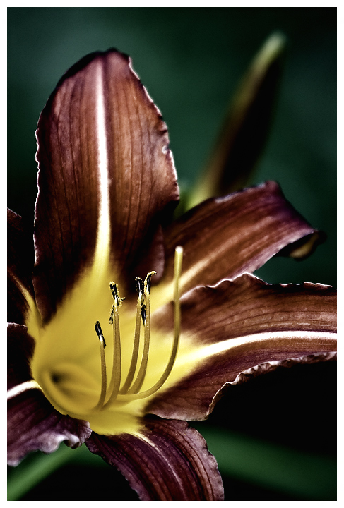
I gave this a 7 too. I loved what you did with the colortone of the flower. I love how that enhances the textures and gives it almost a gritty/grungy feel to the photo.
It's hard for a flower photo to get a good score from me, because it's hard to do something really special with a flower. Flowers are nice, but I guess not my thing. This shot is nice and crisp, and the depth of field is just right. The composition is not bad, although I would consider cropping some more off the top to focus the shot more on the stamens. They are the subject of this image, and the flower outline at the top draws the eye away from the subject. I like the soft lighting, and the shadowed yet still visible depths in the centre of the flower. The overall colours are dark and muted, which is something different for a flower, but the image as a whole is leaning a little toward dark and murky brownish. Giving the red and/or yellow channels (in colour balance) a slight boost might give the colours a little kick without changing the fundamental colour scheme.






 Add photograph to your favorites
 Add photographer to your favorites

 Photographer found comment helpful.


