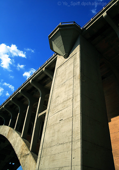
The main street bridge leading into downtown Fort Worth
Pre-challenge notes:
As usual, I hope for a 6, but expect to actually score in the low to mid 5's. One of these days I will learn how to nail a high score every time.
Post-challenge notes:
I'm a bit disappointed with this. I thought I had a good and powerful image here, but the score says barely over "just ok". Thought it had a strong perspective, great colors, detail and the qualities for a high 5 score. I must be seeing something about this one that others do not see.
Statistics
Place: 386 out of 473 Avg (all users): 5.1533 Avg (commenters): 5.2000 Avg (participants): 5.0455 Avg (non-participants): 5.4500 Views since voting: 912 Views during voting: 216 Votes: 150 Comments: 7 Favorites: 0
I like it for its lines and geometric shapes. Contrast is very high but it suits this structure I find. The shaded areas are very dark, I put the shade down to view it in darkness, but i'm afraid many will see it as completely black because they're going to view it with the shades up, mostly. This could have lowered your score a bit. One last point, the subject matter is a bridge, although a majestic structure, we see them everyday and their effect is minimized because of this fact. You really would need to find a very bizarre angle to shoot it from for it to be more interesting for us viewers.
nice perspective, and the sky is a vibrant blue, but there isnt really any main subject of the photo, which kinda makes me wonder what you were going for
Great angle and lighting over your subject. Okay...to reinforce a little help here....the lighting is good in the fact that you have no blown out areas....with that been said...the crop is a little difficult for such a composition, especially with the part visible area on the right. In this style of crop, the lighting is a little dark in the shadow areas causing a lot of viewers to become lost in the structure. If they took more time they would see the detail and different elements within the image. If they don't....they won't see the true value of the image and will more or less vote this image down. If you had maybe gone a bit closer to the tall pillar and shot up the pillar the vertical crop would have worked more...or gone for a horizontal crop and brought in more of the surrounding structure to settle the harsh edges for some of the viewers. For the record I don't alter my votes and this image received a 6 from me.







 Add photograph to your favorites
 Add photographer to your favorites

 Photographer found comment helpful.


