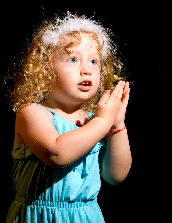
Pretty simple shot.
used 2 strobes with a plastic diffuser on them (which gives a light buld kind of light). One was used as main light and the other was used to fill the shadows. The shadows strob was gelled with CTO gel.
Statistics
Place: 108 out of 112 Avg (all users): 4.0145 Avg (commenters): 3.8571 Avg (participants): 3.7692 Avg (non-participants): 4.1111 Views since voting: 1022 Views during voting: 320 Votes: 138 Comments: 8 Favorites: 0
Color, Saturation, and Hue: Colors are good. Skin tones are accurate, and nothing is over saturated.
Brightness and contrast: Highlight areas are starting to blow out. See forehead, and near right eye. Any brighter and it would become very noticeable. Shadow areas hold good detail.
Focus and depth of field: Focus is nice and sharp. Depth of field is appropriate for image.
Subjective: You were killed by the litteralists who did not see a lightbulb. Even though you used two strobes, it did come across as single bulb lighting. However, they wanted to see the bulb.
I like the look of the lighting, looks like stage lighting. Though it is maybe a tiny bit harsh for my taste as the highlights were starting to burn out, as I mentioned at the top. While I do not need to see a lightbulb, I don't think it fit the challenge as well as others. I think you would have done much better in a free study or portrait challenge, with this photo.
I refuse to DNMC this, as I'm afraid others might. Good use of turning harsh light (presumbaly from one lightbulb) into something flattering. A nine for you.
Originally scored this low as there is no light bulb but reviewed the challenge description and there is no mention that there has to be one so bumping it up. The focus on her eyes is good but I think her face is just very slightly over exposed





 Add photograph to your favorites
 Add photographer to your favorites


 Photographer found comment helpful.


