| Author | Thread |
|
|
07/11/2008 01:03:21 PM |
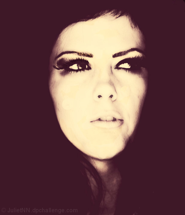
I agree with Jaker and karmat: very cool image that reminds me of an old Life magazine.
I also agree you should fix the visible circles and keep the fixed version for your portfolio (and link to it from here). In the future, try setting the "hardness" of your cloning brush to zero. That will fade the clone effect so you don't have hard edges.
You can decide whether you agree with Judi about making the background truly black. I actually like it the way it is. |
|
 Photographer found comment helpful. Photographer found comment helpful. |
Comments Made During the Challenge  |
|
|
07/07/2008 11:23:31 PM |
|
| Photographer found comment helpful. |
|
|
07/07/2008 10:39:24 PM |
|
I love the processing. and the model to match it. |
|
| Photographer found comment helpful. |
|
|
07/07/2008 03:47:54 PM |
This is a VERY cool photo, and initially one of my favorites in the free study. I don't mean to presume what you did or didn't do in editing, but I'm suspecting there was quite a bit of clone stamp on the face? If yes, I might suggest recalibrating your monitor. I didn't see them at first glance, but there are visible circles all over her face. (And I think maybe some healing brush on the chin as well?)
This is DEFINITELY worth fixing though, as the image itself is awesome. |
|
| Photographer found comment helpful. |
|
|
07/05/2008 06:44:50 PM |
|
very odd photo, its not very sharp, and its over saturated with purple. maybe a little less contrast and color would have helped this photo |
|
| Photographer found comment helpful. |
|
|
07/03/2008 11:30:01 AM |
 JulietNN, I like the processing, as it is somewhat unique. I think the composition could be a little more daring. If her face was off center, I would find this a little more interesting. In this case, I would put more negative space on the right, as this is the direction of her gaze. JulietNN, I like the processing, as it is somewhat unique. I think the composition could be a little more daring. If her face was off center, I would find this a little more interesting. In this case, I would put more negative space on the right, as this is the direction of her gaze. |
|
| Photographer found comment helpful. |
|
|
07/02/2008 07:13:57 PM |
|
interesting processing, not sure i like it but it's different- good job |
|
| Photographer found comment helpful. |
|
|
07/02/2008 06:57:13 PM |
|
Interesting moody portrait, love your pp. |
|
| Photographer found comment helpful. |
|
|
07/01/2008 04:05:37 PM |
|
Looks like it could be on a 70s movie poster. I like the muted colors. |
|
| Photographer found comment helpful. |
|
|
07/01/2008 10:50:22 AM |
|
The blacks on this image really need to be levelled out. |
|
| Photographer found comment helpful. |
|
|
07/01/2008 08:18:31 AM |
|
A very dramatic portrait. |
|
| Photographer found comment helpful. |
|
|
07/01/2008 12:52:32 AM |
|
I like this...has a real creative arty look about it 7 |
|
| Photographer found comment helpful. |
|
|
07/01/2008 12:44:45 AM |
|
Very artistic...I like the tone. |
|
| Photographer found comment helpful. |
Home -
Challenges -
Community -
League -
Photos -
Cameras -
Lenses -
Learn -
Help -
Terms of Use -
Privacy -
Top ^
DPChallenge, and website content and design, Copyright © 2001-2026 Challenging Technologies, LLC.
All digital photo copyrights belong to the photographers and may not be used without permission.
Current Server Time: 07/01/2026 03:26:57 PM EDT.