Critique Club Review:
Color Saturation and Hue: N/A (image is monochrome)
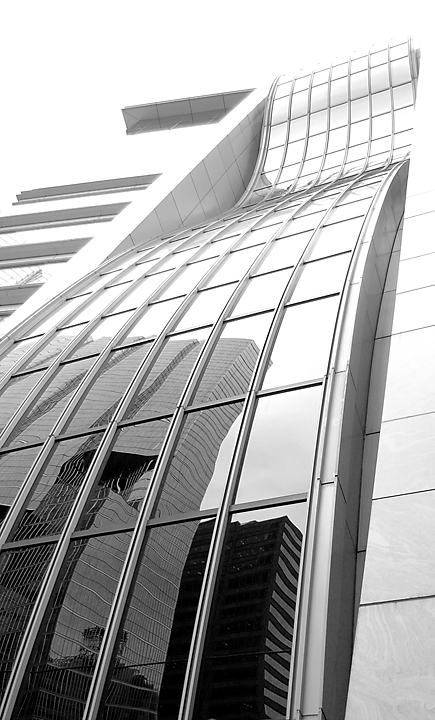
Brightness and contrast: Bright areas are washed out, but it fits with the image. Dark areas are nice and rich.
Focus and depth of field are excellent.
I think I might have liked this one cropped a bit shorter. The building runs out into a featureless sky. A bit to the left and a bit shorter would have worked better for me.
I do like how you showed everything else is straight, even the buildings across the street. Very nice touch.
Looks like your score was hurt a bit by the litteralists who only wanted to see one line.
All in all, a nice image that i think should have scored a bit higher in the challenge. |







 Add photograph to your favorites
 Add photographer to your favorites

 Photographer found comment helpful.


