|
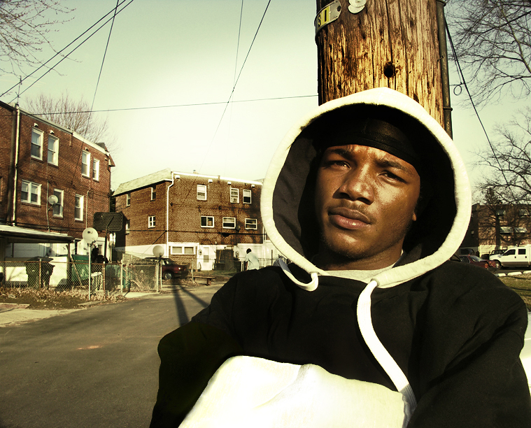
These are all pretty excellent. Your choice of directing the light on the subjects is great, your composition usually spot-on. I don't know if you're particularly looking for critique on how to improve pictures like these, but I might have done something to enhance the focus of attention on your subject in a shot like this. The composition works great with his face right-of-centre, and the way the buildings sort of curve up to the left really balances things well. The background is important in adding context. But it may have improved this picture if you'd have framed it, or cropped it later, so that most of the area above his head is gone. You'll notice that the top of his head and the top part of the leftmost building are lined up, so a tighter crop, removing that big blank space above, might have really balanced things out well. The telephone pole particularly detracts somewhat, just because there's too much of it. I also might have used a shorter depth of field to make the background slightly out of focus, enhancing our attention on the subject. |