- opened in CNX
- white & black control point
- saved as tif opened in PS
- Viveza brighten two lower spots
- curves
- new layer convert to B&W
- crop
- increase canvas, add layer paint bucket (how does roz do those borders??)
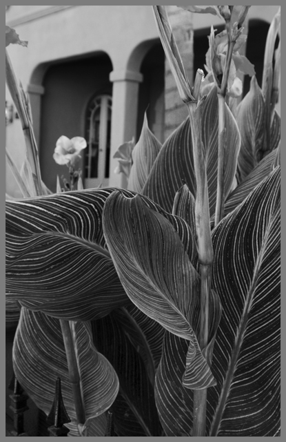
think thats it. i loved the colors in the orig, but thought the texture w
as nicely implied in B&W.
Even though the colors and patterns in the leaves show off beautifully in color, I do think the whole thing comes together nicely and the building gets its chance to shine in the B&W treatment.
I like the choice going b/w. Not only does it put the emphasis on the textures which I find more interesting than the color but it also lowers the focal point from mid-left to mid-bottom (at least for me). In the color version my eyes go straight to the bright part of the leaves (i.e. mid-left) which then leads me upward to the building in the background and out of the photo where as in the b/w I start out much lower due to the darker shadows at the mid-bottom and then read the rest of the image from the very bottom to the top.




 Add photograph to your favorites
 Add photographer to your favorites


 Photographer found comment helpful.


